Button-card z listą input_select

wiem że jest tutaj więcej programistów którzy mogą pomóc :slight_smile:
udało mi się dawno temu ogarnąć listę komunikatów, ostrzeżeń itd zgodnie z instrukcjami które tutaj mamy - działa OK:

jednak aktualnie mocno przerabiam wizualizację pod button-card i chciałbym aby własnie w niej wyświetlała się lista…
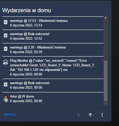
jednak kwestia ogarnięcia aby wszystkie opcje z input_select wyświetlały się jedna pod drugą już nie jest taka prosta - a przynajmniej mi się tak wydaje, wyświetla mi się jako lista jedno za drugim:

image

może ktoś pomóc jak to ogarnąć ?

type: custom:button-card
entity: input_select.warnings
name: Lista ostrzerzeń
tap_action:
  action: more-info
double_tap_action:
  action: more-info
hold_action:
  action: more-info
custom_fields:
  sensor_1: |
    [[[
     return `<span>
     ${states['input_select.warnings'].attributes.options}
    </span>`
    ]]]
styles:
  card:
    - padding: 5px 15px
    - background: linear-gradient(rgba(255,255,255,0.1) 25%, rgba(0,0,20,0.3)50%)
    - border-radius: 15px
    - border: solid 3px rgb(17,80,73,1)
    - color: ivory
  img_cell:
    - justify-content: start
    - align-items: start
    - margin: none
  icon:
    - width: 10%
    - margin-top: 0%
    - color: rgb(17,80,73,1)
  name:
    - color: white
    - font-weight: bold
    - font-size: 150%
    - padding: 15px 0px 0px 0px
  grid:
    - grid-template-areas: '"n n" "i i" "l l" "sensor_1 sensor_1" '
    - grid-template-rows: min-content 1fr min-content
  custom_fields:
    sensor_1:
      - color: rgb(17,80,73)
      - justify-self: start
      - font-size: 13px
      - padding: 12px 0px 0px 0px

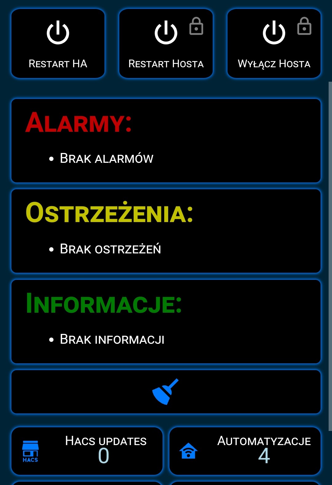
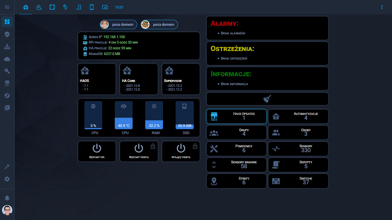
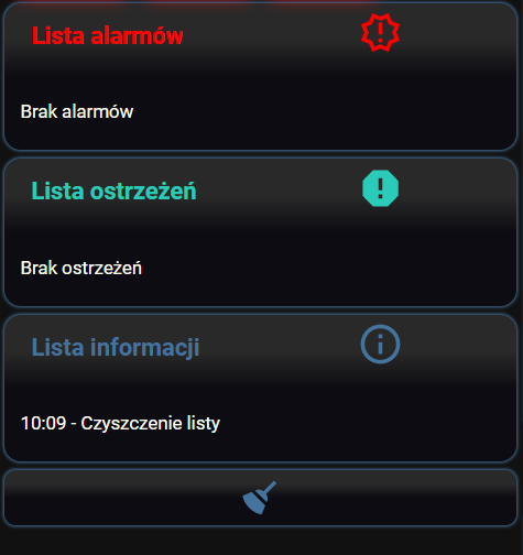
Ja mam przerobiony cały interfejs HA pod button-card ale akurat do tematu wyglądu list poszedłem trochę inaczej. Posłużyłem się stylem karty aby upodobnić ja do wyglądu reszty wykonanej za pomocą button-card.
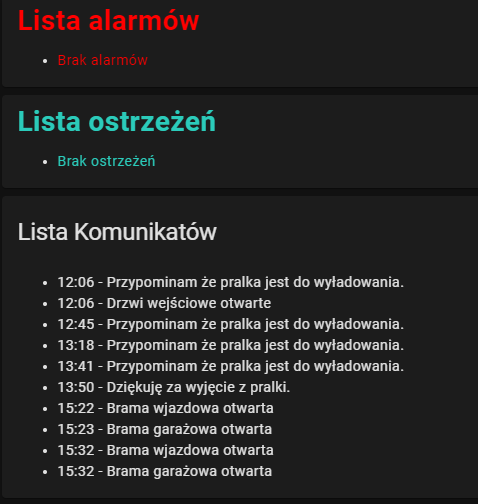
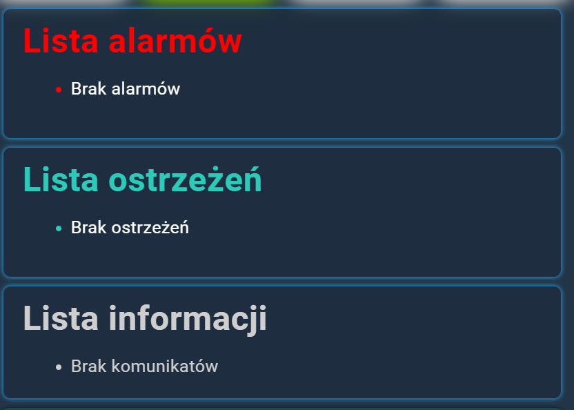
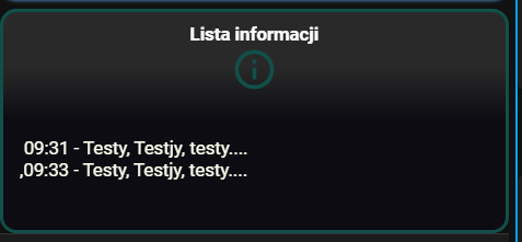
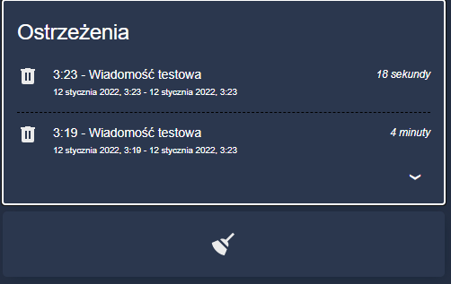
Wygląda to tak:

type: markdown
content: |-
  # <font color='#c00000'>Alarmy:</font>
  {% for i in states.input_select.alarmy.attributes.options %}
  -  {{i }} 
  {%- endfor %}
style: |
  ha-card {
    margin-left: 9px;
    margin-right: 9px;
    box-shadow: 0px 0px 3px 1px var(--primary-color);
    font-variant: small-caps;
    background: rgb(0,0,0);
  }
1 polubienie

Dodaj - white-space: normal do sekcji

custom_fields:
    sensor_1:
      - color: rgb(17,80,73)
      - justify-self: start
      - font-size: 13px
      - padding: 12px 0px 0px 0px

Lub skorzystaj z HACS → Interfejs home-feed-card
Screenshot - 06.01.2022 , 20_26_05

Dzięki @artpc jednak dodanie white-space powoduje że łamie się linia a nie wyświetla lista :slight_smile:

image

sprawdzę home-feed-card i coś pokombinuje że pomysłem @MariuszT bo wygląda również zacnie :slight_smile:

dzięki !!

podziel się proszę całym kodem z tej karty, ładnie to wygląda :slight_smile:

póki nie mam rozwiązania na button-card zrobiłem tak u siebie :slight_smile:

dla poszczególnych elementów podmieniasz kolor i input_select

type: markdown
content: |-
  #  <font color = 'red' > Lista alarmów
  #  <font color = 'white' >
  {% for i in states.input_select.alarmy.attributes.options %}
   -  {{i }} 
  {%- endfor %}
  </font> 
style: |
  ha-card {
    margin-left: 9px;
    margin-right: 9px;
    box-shadow: 0px 0px 3px 1px var(--primary-color);
  }

Nie ma problemu.
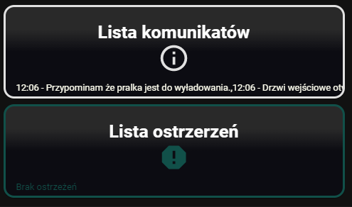
Tyle tylko, że obecnie wygląda to u mnie już trochę inaczej. Zdjęcie które pokazałem wcześniej było zrobione już jakiś czas temu, pochodziło ze zrzutów ekranu z telefonu. Obecnie wygląda to tak:

Inna kolorystyka za sprawą innego motywu, inny układ.

Jeżeli chodzi o kod do widocznych kart to przedstawia się tak:

type: vertical-stack
cards:
  - type: horizontal-stack
    cards:
      - type: custom:button-card
        template: vertical-divider-grey
      - type: custom:person-entity-card
        centered: true
        showAtHome: true
        entities:
          - person.malgosia
          - person.justynka
        style: |
          ha-card {
            height: 40px;
          }
      - type: custom:button-card
        template: vertical-divider-grey
  - type: horizontal-stack
    cards:
      - type: custom:button-card
        template: vertical-divider-grey
      - type: custom:button-card
        template: device_button
        tap_action:
          action: navigate
          navigation_path: /config/logs
        styles:
          card:
            - height: null
        custom_fields:
          jeden: |
            [[[
              return `<ha-icon
                icon="mdi:ip-network"
                style="width: 20px; height: 20px; color: rgb(85,193,241)">
                </ha-icon><span> Adres IP: <span style="color: lightgreen;">${states['sensor.ipv4'].state}</span></span>`
            ]]]
          dwa: |
            [[[
              return `<ha-icon
                icon="mdi:raspberry-pi"
                style="width: 20px; height: 20px; color: rgb(85,193,241)">
                </ha-icon><span> RPi pracuje: <span style="color: lightgreen;">${states['sensor.rpi_uptime'].state}</span></span>`
            ]]]
          trzy: |
            [[[
              return `<ha-icon
                icon="mdi:home-assistant"
                style="width: 20px; height: 20px; color: rgb(85,193,241)">
                </ha-icon><span> HA pracuje: <span style="color: lightgreen;">${states['sensor.ha_uptime'].state}</span></span>`
            ]]]
          cztery: |
            [[[
              return `<ha-icon
                icon="mdi:database"
                style="width: 20px; height: 20px; color: rgb(85,193,241)">
                </ha-icon><span> MariaDB: <span style="color: lightgreen;">${states['sensor.database_rozmiar'].state} MB</span></span>`
            ]]]
      - type: custom:button-card
        template: vertical-divider-grey
  - type: custom:button-card
    template: vertical-divider-grey
  - type: horizontal-stack
    cards:
      - type: custom:button-card
        template: vertical-divider-grey
      - type: custom:button-card
        entity: binary_sensor.home_assistant_operating_system_update_available
        icon: mdi:home-assistant
        template: ha_version_button
        name: HAOS
        hold_action:
          action: navigate
          navigation_path: /config/dashboard
        custom_fields:
          obecna: |
            [[[
              return `<span> - <span style='color: var(--text-color-sensor);'>${states['sensor.home_assistant_operating_system_version'].state}</span></span>`
            ]]]
          dostepna: |
            [[[
              return `<span> - <span style='color: var(--text-color-sensor);'>${states['sensor.home_assistant_operating_system_newest_version'].state}</span></span>`
            ]]]
      - type: custom:button-card
        template: vertical-divider-grey
      - type: custom:button-card
        entity: sensor.core_update
        icon: mdi:home-assistant
        template: ha_version_button
        name: HA Core
        hold_action:
          action: navigate
          navigation_path: /config/dashboard
        custom_fields:
          obecna: |
            [[[
              return `<span> - <span style='color: var(--text-color-sensor);'>${states['sensor.version_current'].state}</span></span>`
            ]]]
          dostepna: |
            [[[
              return `<span> - <span style='color: var(--text-color-sensor);'>${states['sensor.version_available'].state}</span></span>`
            ]]]
      - type: custom:button-card
        template: vertical-divider-grey
      - type: custom:button-card
        entity: sensor.supervisor_update
        icon: mdi:home-assistant
        template: ha_version_button
        name: Supervisor
        hold_action:
          action: navigate
          navigation_path: /config/dashboard
        custom_fields:
          obecna: |
            [[[
              return `<span> - <span style='color: var(--text-color-sensor);'>${states['sensor.supervisor_update'].attributes.current_version}</span></span>`
            ]]]
          dostepna: |
            [[[
              return `<span> - <span style='color: var(--text-color-sensor);'>${states['sensor.supervisor_update'].attributes.newest_version}</span></span>`
            ]]]
      - type: custom:button-card
        template: vertical-divider-grey
  - type: custom:button-card
    template: vertical-divider-grey
  - type: custom:stack-in-card
    cards:
      - type: horizontal-stack
        cards:
          - type: custom:bar-card
            entities:
              - entity: sensor.cpu_use
            entity_row: true
            name: CPU
            direction: up
            height: 100px
            width: 70px
            target: 1550
            unit_of_measurement: null
            positions:
              icon: inside
              indicator: 'off'
              value: inside
              name: outside
            severity:
              - from: 0
                to: 60
                color: rgba(57,128,228)
              - from: 61
                to: 85
                color: orange
              - from: 86
                to: 100
                color: red
            minmax: 'off'
            style: |
              ha-card {
                margin-top: 10px;
              }
              bar-card-value {
                color: white;
              }
          - type: custom:bar-card
            entities:
              - entity: sensor.cpu_temp
            entity_row: true
            name: CPU
            direction: up
            height: 100px
            width: 70px
            target: 1550
            positions:
              icon: inside
              indicator: 'off'
              value: inside
              name: outside
            severity:
              - from: 0
                to: 60
                color: rgba(57,128,228)
              - from: 61
                to: 85
                color: orange
              - from: 86
                to: 100
                color: red
            minmax: 'off'
            style: |
              ha-card {
                margin-top: 10px;
              }
              bar-card-value {
                color: white;
              }
          - type: custom:bar-card
            entities:
              - entity: sensor.memory_use_percent
            entity_row: true
            name: RAM
            direction: up
            height: 100px
            width: 70px
            target: 1550
            positions:
              icon: inside
              indicator: 'off'
              value: inside
              name: outside
            severity:
              - from: 0
                to: 50
                color: rgba(57,128,228)
              - from: 51
                to: 85
                color: orange
              - from: 86
                to: 100
                color: red
            minmax: 'off'
            style: |
              ha-card {
                margin-top: 10px;
              }
              bar-card-value {
                color: white;
              }
          - type: custom:bar-card
            entities:
              - entity: sensor.disk_use
            entity_row: true
            name: SSD
            direction: up
            height: 100px
            width: 70px
            max: 122
            target: 1550
            positions:
              icon: inside
              indicator: 'off'
              value: inside
              name: outside
            severity:
              - from: 0
                to: 90
                color: rgba(57,128,228)
              - from: 90
                to: 110
                color: orange
              - from: 110
                to: 122
                color: red
            minmax: 'off'
            style: |
              ha-card {
                margin-top: 10px;
              }
              bar-card-value {
                color: white;
              }
    style: |
      ha-card {
        margin-left: 9px;
        margin-right: 9px;
        box-shadow: 0px 0px 3px 1px var(--state-icon-color);
        height: 150px;
        border-radius: 10px;
        background-color: rgb(0,0,0)
      }
  - type: custom:button-card
    template: vertical-divider-grey
  - type: horizontal-stack
    cards:
      - type: horizontal-stack
        cards:
          - type: custom:button-card
            template: vertical-divider-grey
          - type: custom:button-card
            template: alert_button
            tap_action:
              action: call-service
              service: homeassistant.restart
            hold_action:
              action: navigate
              navigation_path: /config/server_control
            name: Restart HA
            icon: mdi:power
            styles:
              card:
                - box-shadow: 0px 0px 3px 1px var(--state-icon-color)
                - height: 80px
              name:
                - font-size: 11px
          - type: custom:button-card
            template: vertical-divider-grey
          - type: custom:button-card
            template: alert_button
            tap_action:
              action: call-service
              service: hassio.host_reboot
            name: Restart Hosta
            icon: mdi:power
            lock:
              enabled:
                - - - return entity.state === 'on';
              unlock: hold
              exemptions:
                - username: Mariusz
            styles:
              card:
                - box-shadow: 0px 0px 3px 1px var(--state-icon-color)
                - height: 80px
              name:
                - font-size: 11px
          - type: custom:button-card
            template: vertical-divider-grey
          - type: custom:button-card
            template: alert_button
            tap_action:
              action: call-service
              service: hassio.host_shutdown
            name: Wyłącz Hosta
            icon: mdi:power
            lock:
              enabled:
                - - - return entity.state === 'on';
              unlock: hold
              exemptions:
                - username: Mariusz
            styles:
              card:
                - box-shadow: 0px 0px 3px 1px var(--state-icon-color)
                - height: 80px
              name:
                - font-size: 11px
          - type: custom:button-card
            template: vertical-divider-grey
type: vertical-stack
cards:
  - type: markdown
    content: |-
      # <font color='#c00000'>Alarmy:</font>
      {% for i in states.input_select.alarmy.attributes.options %}
      -  {{i }} 
      {%- endfor %}
    style: |
      ha-card {
        margin-left: 9px;
        margin-right: 9px;
        box-shadow: 0px 0px 3px 1px var(--state-icon-color);
        font-variant: small-caps;
        background: rgb(0,0,0);
        border-radius: 10px
      }
  - type: markdown
    content: |-
      #  <font color='#c1c100'>Ostrzeżenia:</font>
      {% for i in states.input_select.ostrzezenia.attributes.options %}
      -  {{i }} 
      {%- endfor %}
    style: |
      ha-card {
        margin-left: 9px;
        margin-right: 9px;
        box-shadow: 0px 0px 3px 1px var(--state-icon-color);
        font-variant: small-caps;
        background: rgb(0,0,0);
        border-radius: 10px
      }
  - type: markdown
    content: |-
      #  <font color='#007a00'>Informacje:</font>
      {% for i in states.input_select.informacje.attributes.options %}
      -  {{i }} 
      {%- endfor %}
    style: |
      ha-card {
        margin-left: 9px;
        margin-right: 9px;
        box-shadow: 0px 0px 3px 1px var(--state-icon-color);
        font-variant: small-caps;
        background: rgb(0,0,0);
        border-radius: 10px
      }
  - type: button
    entity: input_boolean.wyczysc_alarmy_i_ostrzezenia
    show_name: false
    icon_height: 40px
    style: |
      ha-card {
        margin-left: 9px;
        margin-right: 9px;
        box-shadow: 0px 0px 3px 1px var(--state-icon-color);
        font-variant: small-caps;
        background: rgb(0,0,0);
        max-height: 50px;
        border-radius: 10px
      }
  - type: custom:button-card
    template: vertical-divider-grey
  - type: horizontal-stack
    cards:
      - type: custom:button-card
        template: vertical-divider-grey
      - type: custom:button-card
        entity: sensor.hacs
        name: Hacs Updates
        hold_action:
          action: navigate
          navigation_path: /hacs
        show_name: true
        layout: icon_state_name2nd
        styles:
          grid:
            - grid-template-areas: '"i n" "i s" "i ilosc"'
            - grid-template-columns: 1fr 75%
          card:
            - height: 55px
            - font-size: 22px
            - background-color: black
            - border-radius: 10px
            - box-shadow: >
                [[[ if (entity.state > '0') return '0px 0px 5px 1px
                var(--primary-color)'; 
                      return '0px 0px 3px 1px var(--state-icon-color)';
                ]]]
            - font-variant: small-caps
          icon:
            - color: |
                [[[
                  if (entity.state > '0') return 'var(--primary-color)'; 
                  return 'var(--state-icon-color)';
                ]]]
            - width: 60%
          name:
            - font-size: 13px
            - color: White
        custom_fields:
          ilosc: |
            [[[
              return `<span style='color: var(--text-color-sensor);'>${entity.state}</span>`
            ]]]
      - type: custom:button-card
        entity: sensor.automatyzacje
        template: count_button
        hold_action:
          action: navigate
          navigation_path: /config/automation/dashboard
      - type: custom:button-card
        template: vertical-divider-grey
  - type: horizontal-stack
    cards:
      - type: custom:button-card
        template: vertical-divider-grey
      - type: custom:button-card
        entity: sensor.grupy
        template: count_button
        hold_action:
          action: navigate
          navigation_path: /config/entities
      - type: custom:button-card
        entity: sensor.osoby
        template: count_button
        hold_action:
          action: navigate
          navigation_path: /config/person
      - type: custom:button-card
        template: vertical-divider-grey
  - type: horizontal-stack
    cards:
      - type: custom:button-card
        template: vertical-divider-grey
      - type: custom:button-card
        entity: sensor.pomocnicy
        template: count_button
        hold_action:
          action: navigate
          navigation_path: /config/helpers
      - type: custom:button-card
        entity: sensor.sensory
        template: count_button
        hold_action:
          action: navigate
          navigation_path: /config/entities
      - type: custom:button-card
        template: vertical-divider-grey
  - type: horizontal-stack
    cards:
      - type: custom:button-card
        template: vertical-divider-grey
      - type: custom:button-card
        entity: sensor.sensory_binarne
        template: count_button
        hold_action:
          action: navigate
          navigation_path: /config/entities
      - type: custom:button-card
        entity: sensor.skrypty
        template: count_button
        hold_action:
          action: navigate
          navigation_path: /config/script/dashboard
      - type: custom:button-card
        template: vertical-divider-grey
  - type: horizontal-stack
    cards:
      - type: custom:button-card
        template: vertical-divider-grey
      - type: custom:button-card
        entity: sensor.strefy
        template: count_button
        hold_action:
          action: navigate
          navigation_path: /config/zone
      - type: custom:button-card
        entity: sensor.switche
        template: count_button
        hold_action:
          action: navigate
          navigation_path: /config/entities
      - type: custom:button-card
        template: vertical-divider-grey

a ponieważ korzystam z buuton-card templates, to jeszcze potrzebne będzie:

button_card_templates:
  vertical-divider-grey:
    color_type: blank-card
    styles:
      card:
        - width: 1px
        - color: '#292929'
  alert_button:
    state:
      - value: 'on'
        styles:
          card:
            - box-shadow: 0px 0px 5px 1px var(--primary-color)
    styles:
      card:
        - height: 97px
        - background-color: black
        - border-radius: 10px
        - padding: 5%
        - font-size: 22px
        - box-shadow: 0px 0px 3px 1px var(--state-icon-color)
        - font-variant: small-caps
      grid:
        - grid-template-areas: '"i i" "n n" "s s"'
        - grid-template-columns: 1fr 1fr
        - grid-template-rows: 1fr min-content min-content
      name:
        - font-size: 13px
        - color: White
        - align-self: middle
        - justify-self: middle
        - padding-bottom: 4px
      state:
        - font-size: 15px
      img_cell:
        - justify-content: middle
        - align-items: middle
        - margin: none
      icon:
        - width: 40%
        - margin-top: '-5%'
  count_button:
    show_state: true
    show_name: true
    layout: icon_state_name2nd
    styles:
      grid:
        - grid-template-areas: '"i n" "i s" "i l"'
        - grid-template-columns: 1fr 75%
      card:
        - height: 55px
        - font-size: 22px
        - background-color: black
        - border-radius: 10px
        - box-shadow: 0px 0px 3px 1px var(--state-icon-color)
        - font-variant: small-caps
      icon:
        - color: var(--state-icon-color)
        - width: 60%
      name:
        - font-size: 13px
        - color: White
      state:
        - margin-top: '-30px'
  device_button:
    styles:
      card:
        - height: 210px
        - background-color: rgb(0,0,0)
        - box-shadow: 0px 0px 3px 1px var(--state-icon-color)
        - border-radius: 10px
        - padding: 2%
        - font-variant: small-caps
      grid:
        - grid-template-areas: >-
            "i topright" "bar bar" "jeden jeden" "dwa dwa" "trzy trzy" "cztery
            cztery" "piec topleft" "szesc szesc" "siedem siedem" "osiem osiem"
        - grid-template-columns: 1fr
        - grid-template-rows: >-
            1fr min-content min-content min-content min-content min-content
            min-content min-content min-content min-content
      img_cell:
        - justify-content: start
        - align-items: start
        - padding-bottom: 1%
      icon:
        - width: 33%
        - margin-top: 2%
        - margin-left: 35%
        - color: rgb(0,122,255)
      custom_fields:
        jeden:
          - margin-left: 2%
          - padding-bottom: 2px
          - align-self: middle
          - justify-self: start
          - font-size: 13px
        dwa:
          - margin-left: 2%
          - padding-bottom: 2px
          - align-self: middle
          - justify-self: start
          - font-size: 13px
        trzy:
          - margin-left: 2%
          - padding-bottom: 2px
          - align-self: middle
          - justify-self: start
          - font-size: 13px
        cztery:
          - margin-left: 2%
          - padding-bottom: 2px
          - align-self: middle
          - justify-self: start
          - font-size: 13px
        piec:
          - margin-left: 2%
          - padding-bottom: 2px
          - align-self: middle
          - justify-self: start
          - font-size: 13px
        szesc:
          - margin-left: 2%
          - padding-bottom: 2px
          - align-self: middle
          - justify-self: start
          - font-size: 13px
        siedem:
          - margin-left: 2%
          - padding-bottom: 2px
          - align-self: middle
          - justify-self: start
          - font-size: 13px
        osiem:
          - margin-left: 2%
          - padding-bottom: 2px
          - align-self: middle
          - justify-self: start
          - font-size: 13px
        topright:
          - position: absolute
          - right: 5%
          - top: 5%
          - font-size: 14px
          - height: 100px
        topleft:
          - position: absolute
          - left: 1px
          - top: 1px
          - width: 97%
          - margin-top: '-3%'
        bar:
          - padding-left: 5px
          - padding-right: 5px
          - '--ha-card-background': rgba(0, 0, 0, 0.0)
  ha_version_button:
    state:
      - value: 'on'
        styles:
          card:
            - box-shadow: 0px 0px 5px 1px var(--primary-color)
    styles:
      card:
        - height: 120px
        - background-color: black
        - border-radius: 10px
        - padding: 5%
        - font-size: 12px
        - text-transform: capitalize
        - box-shadow: 0px 0px 3px 1px var(--state-icon-color)
        - font-variant: small-caps
      grid:
        - grid-template-areas: '"i i" "n n" "obecna obecna" "dostepna dostepna" '
        - grid-template-columns: 1fr 1fr
        - grid-template-rows: 1fr min-content min-content min-content min-content
      name:
        - font-weight: bold
        - font-size: 13px
        - color: White
        - align-self: middle
        - justify-self: start
        - padding-bottom: 4px
      img_cell:
        - justify-content: start
        - align-items: start
        - margin: none
      icon:
        - color: |
            [[[
              if (entity.state == 'on') return 'var(--primary-color)';
              return 'var(--state-icon-color)';
            ]]]
        - width: 30%
        - margin-top: '-5%'
      custom_fields:
        obecna:
          - align-self: start
          - justify-self: start
          - margin-left: 10px
        dostepna:
          - padding-bottom: 5px
          - align-self: start
          - justify-self: start
          - margin-left: 10px

Te button-card templates trzeba wpisać do pliku konfiguracji Lovelace, klikając kolejno w trzy kropki a potem w pozycję zaznaczoną strzałką.

temp

Najlepiej wpisać od razu bezpośrednio pod pierwszą linijką z pliku:
title: Home Assistant

Motyw jakiego używam to ten podany poniżej, chociaż częściowo też zmodyfikowany pod moje potrzeby:

1 polubienie

widać że trochę Ci to zajeło :slight_smile: skopiował bym od Ciebie super informację o aktualnych wersjach, jednak potrzebuję danych…
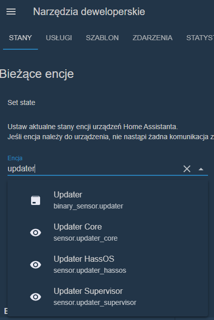
skąd ściągasz encje - bo wyglądają jak template z czegoś ściągnięte :slight_smile: z góry dzięki !!

  • binary_sensor.home_assistant_operating_system_update_available
  • sensor.home_assistant_operating_system_version
  • sensor.home_assistant_operating_system_newest_version

EDIT - nie aktualne - udało mi się :slight_smile: DZIĘKI !!

Zamiast pisać nieaktualne napisałbyś, że to np. pochodzi z integracji z Supervisorem, co to za zakichany zwyczaj pytać, a potem nie podawać samodzielnie znalezionego rozwiązania…

4 polubienia

Post poszedł w zupełnie inną stronę więc i tak by nikt tutaj nie szukał tego czego potrzebuje… nie rozumiem oburzenia.
PS następnym razem usune zapytanie i problem z głowy…

Wyobraź sobie hipotetyczną sytuację - wpada tu Czytelnik, (niekoniecznie po to by zadać pytanie - fora są również, a właściwie przede wszystkim po to by je czytać) i czyta ten cały temat, bo tytuł wydał mu się interesujący, ale jednak zdecydował, że nie będzie wdrażać żadnego z pomysłów oprócz tego, który zaintrygował Ciebie 3 posty wyżej i czyta pytanie po czym to:

czy teraz już rozumiesz?

Ile czasu więcej (a może mniej?) by zajęło napisanie gdzie znalazłeś te encje zamiast pisać, że nieaktualne?

2 polubienia

ciężko mi to przez gardło przechodzi ale masz rację :slight_smile: (żarcik)

dla potomnych:

każdy z sensorów ma swoje atrybuty

1 polubienie

Jednak źle zadałem pytanie…
binary_sesor.updater pochodzi z tej integracji (która “fabrycznie” jest włączona, więc każdy to ma, o ile sobie nie wyłączy)

ale pozostałe są z integracji z Supervisorem… więc najpierw trzeba je aktywować w integracji, bo z powietrza się nie biorą (po premierze, gdy były domyślnie włączone ktoś jednak pomyślał i obecnie ta integracja ma domyślnie wyłączone sensory).

PS wyszukiwarka encji jest w samym dashboardzie Lovelace wystarczy mając fokus na jakimś neutralnym elemencie wcisnąć “e” z klawiatury.

1 polubienie

Na bazie powyższego posta zacząłem naukę button-card. Utknąłem na dwóch problemach i proszę o pomoc.

Jak zmniejszyć czcionkę na przyciskach? Wstawione font-size: 5px nie zmienia czcionki.
Jak uzyskujecie zaokrąglone narożniki przycisków?

Poniżej kod jednego z moich przycisków.

entity: light.modul_2x_dimmer_1_l1
name: Sufit
font-size: 5px
icon: mdi:ceiling-light-multiple
aspect_ratio: 2/1
state:
  - value: 'on'
    styles:
      card:
        - '-webkit-box-shadow': 0 0 0.95rem 0.2rem var(--button-card-light-color)
        - box-shadow: 0 0 0.95rem 0.2rem var(--button-card-light-color)
        - transition: all 2s ease
style: |
  ha-card:hover {
  transform: scale(1.05);
  box-shadow: 0 0 10px;
  }
double_tap_action:
  action: more-info```

font-size wpisujesz nie w tym miejscu, zaokrąglone narożniki to:
border-radius: 10px
Popatrz na różnice poniżej:

name: Sufit
icon: mdi:ceiling-light-multiple
aspect_ratio: 2/1
styles:
  card:
    - font-size: 5px
    - border-radius: 10px
state:
  - value: 'on'
    styles:
      card:
        - '-webkit-box-shadow': 0 0 0.95rem 0.2rem var(--button-card-light-color)
        - box-shadow: 0 0 0.95rem 0.2rem var(--button-card-light-color)
        - transition: all 2s ease
style: |
  ha-card:hover {
  transform: scale(1.05);
  box-shadow: 0 0 10px;
  }
double_tap_action:
  action: more-info```
1 polubienie

Pomogło, bardzo ci dziękuję.

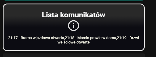
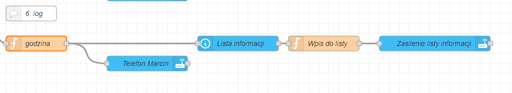
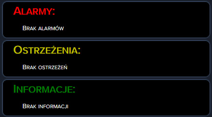
wczoraj trochę powalczyłem ze swoim pierwonym planem - ponieważ button-custom jednak ma większe możliwości konfiguracji i parametryzacji i udało mi się uzyskać efekt jak poniżej:

image
przełamanie lini jest przez wciśnięcie znaku łamania lini - czyli \r
no tylko że wszystkie atrybuty wyświetlały się domyślnie z przecinkiem…,
jakiś pomysł aby przecinek nie był wyświetlany lub aby go usuwać ?

type: custom:button-card
entity: input_select.informacje
name: Lista informacji
tap_action:
  action: more-info
double_tap_action:
  action: more-info
hold_action:
  action: more-info
custom_fields:
  sensor_1: |
    [[[
     return `<span>
     ${states['input_select.informacje'].attributes.options}
    </span>`

    ]]]
styles:
  card:
    - padding: 5px 15px
    - background: linear-gradient(rgba(255,255,255,0.1) 25%, rgba(0,0,20,0.3)50%)
    - border-radius: 15px
    - border: solid 3px rgb(17,80,73,1)
    - color: ivory
  img_cell:
    - justify-content: start
    - align-items: start
    - margin: none
  icon:
    - width: 10%
    - margin-top: 0%
    - color: rgb(17,80,73,1)
  name:
    - color: white
    - font-weight: bold
    - font-size: 100%
    - padding: 5px 0px 1px 0px
  grid:
    - grid-template-areas: '"n" "i" "sensor_1" '
    - grid-template-rows: min-content 1fr min-content
  custom_fields:
    sensor_1:
      - justify-self: start
      - white-space: pre-wrap

wycinek z powiadomień jak niżej:

funkcja łamania lini dodana do funkcji godzina:

var czas = new Date();

function addZero(i) {
if (i < 10) {i = "0" + i}
return i;
}

var h = addZero(czas.getHours());
var m = addZero(czas.getMinutes());
var czas_formatowany = h + ":" + m + " - "

msg.wiadomosc =
{
    "tresc"  : czas_formatowany + msg.wiadomosc.tresc +"\r",
}
msg.payload =
{
    "data":
    {
        "message":  msg.wiadomosc.tresc,
    }
}
return msg;

EDIT: udało mi się przerobić w NR składnię i \r dodaję na początku przez co uzyskuje oczekiwany efekt:

image
przełamanie lini przez polecenie - white-space: pre-line - jednak widać że robi sporo miejsca z góry i z dołu (ten typ tak ma) może ktoś wie jak to wywaliść? odrazu mówię nie działa padding z minusową wartością :slight_smile:

poniżek kod YAML do wizu jak by ktoś chciał:

type: custom:button-card
entity: input_select.informacje
name: Lista informacji
tap_action:
  action: more-info
double_tap_action:
  action: more-info
hold_action:
  action: more-info
custom_fields:
  sensor_1: |
    [[[
     return `<span>
     ${states['input_select.informacje'].attributes.options}
    </span>`

    ]]]
styles:
  card:
    - padding: 5px 15px
    - background: linear-gradient(rgba(255,255,255,0.1) 25%, rgba(0,0,20,0.3)50%)
    - border-radius: 15px
    - box-shadow: 0px 0px 3px 1px var(--state-icon-color)
    - color: ivory
  icon:
    - width: 10%
    - color: var(--state-icon-color)
  name:
    - font-weight: bold
    - padding: 5px 0px 1px 0px
  grid:
    - grid-template-areas: '"n n"  "i i" "sensor_1 sensor_1" '
    - grid-template-rows: min-content  min-content 1fr
  custom_fields:
    sensor_1:
      - white-space: pre-line
      - text-align: start

Screenshot - 12.01.2022 , 03_24_11

Rozwijana lista

Kod karty:

desc: true
hiddenState:
  - Brak ostrzeżeń
state_map:
  - icon: mdi:stove
    value: Wiadomość testowa
entity: input_select.warnings
title: Ostrzeżenia
duration_labels:
  second: ${value} sekund
  seconds: ${value} sekundy
  minute: ${value} minut
  minutes: ${value} minuty
  hour: ${value} heure
  hours: ${value} heures
  day: ${value} dzień
  days: ${value} dni
show:
  state: true
  collapse: 3
  duration: true
  start_date: true
  end_date: true
  icon: true
  separator: true
separator: true
separator_style:
  color: black
  style: dashed
collapse: 2
max_items: 10
history: 5

Kod Karty z czyszczeniem:

cards:
  - type: custom:logbook-card
    desc: true
    hiddenState:
      - Brak ostrzeżeń
    state_map:
      - icon: mdi:stove
        value: Wiadomość testowa
    entity: input_select.warnings
    title: Ostrzeżenia
    duration_labels:
      second: ${value} sekund
      seconds: ${value} sekundy
      minute: ${value} minut
      minutes: ${value} minuty
      hour: ${value} heure
      hours: ${value} heures
      day: ${value} dzień
      days: ${value} dni
    show:
      state: true
      collapse: 3
      duration: true
      start_date: true
      end_date: true
      icon: true
      separator: true
    separator: true
    separator_style:
      color: black
      style: dashed
    collapse: 2
    max_items: 10
    history: 5
  - entity: input_boolean.alarmy_wyczysc
    hold_action:
      action: more-info
    icon_height: 33px
    show_icon: true
    show_name: false
    show_state: false
    tap_action:
      action: toggle
    type: button
style: |
  ha-card {
    box-shadow:
      {% if is_state('sun.sun', 'above_horizon') %}
        -5px -5px 15px #ffffff, 5px 5px 15px #ebebeb;
      {% elif is_state('sun.sun', 'below_horizon') %}
        -5px -5px 15px #2c2c2c, 5px 5px 15px #191919;
      {% endif %}
    background-color: var(--primary-background-color);
    width: 250px;
    border-radius: 10px;
    margin: 10px auto;
  } 

custom:logbook-card
Instalacja z HACS Logbook Card
Strona integracji :
https://github.com/royto/logbook-card#state-map-object

2 polubienia

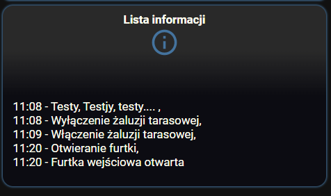
wygląda ładnie jednak czas który poświęciłem na button-custom powoduje że zostaje przy tym :slight_smile: moja lista informacji trochę rośnie i może być tego za dużo z taką ilością danych.
jeżeli ktoś chce to prezentuję moje rozwiązanie:


kod karty informacji:

type: custom:button-card
entity: input_select.informacje
name: Lista informacji
tap_action:
  action: more-info
double_tap_action:
  action: more-info
hold_action:
  action: more-info
custom_fields:
  sensor_1: |
    [[[
     return `<span>
     ${states['input_select.informacje'].attributes.options}
    </span>`

    ]]]
styles:
  card:
    - padding: 5px 15px
    - background: linear-gradient(rgba(255,255,255,0.1) 25%, rgba(0,0,20,0.3)50%)
    - border-radius: 15px
    - box-shadow: 0px 0px 3px 1px var(--state-icon-color)
    - color: ivory
  icon:
    - width: 20%
    - color: var(--state-icon-color)
  name:
    - color: var(--state-icon-color)
    - font-weight: bold
    - padding: 5px 0px 1px 0px
    - justify-self: start
    - font-size: 130%
    - padding-left: 10px
  grid:
    - grid-template-areas: '"n i" "sensor_1 sensor_1" '
    - grid-template-columns: 1fr 1fr
  custom_fields:
    sensor_1:
      - white-space: pre-line
      - text-align: start

kod kasowania:

type: custom:button-card
entity: input_boolean.alarmy_wyczysc
show_state: false
name: Kasowanie komunikatów
show_name: false
double_tap_action:
  action: more-info
hold_action:
  action: more-info
state:
  - value: 'on'
    styles:
      card:
        - box-shadow: 0 0 0.95rem 0.2rem deepskyblue
        - border: solid 3px deepskyblue
        - transition: all 1s ease
        - icon-color: red
styles:
  card:
    - height: min(180vw, 50px)
    - font-size: 11px
    - padding: 0px 0px
    - background: linear-gradient(rgba(255,255,255,0.1) 25%, rgba(0,0,20,0.3)50%)
    - border-radius: 10px
    - box-shadow: 0px 0px 3px 1px var(--state-icon-color)
    - color: ivory
  icon:
    - height: 80%
    - color: |
        [[[
          if (entity.state == 'on') return 'yellow';
          if (entity.state == 'off') return 'var(--state-icon-color)';
          else return 'grey';
        ]]]
  grid:
    - grid-template-areas: '"n" "i"'
    - grid-template-rows: min-content 1fr min-content

1 polubienie

Drobna kosmetyka i efekt początkowy jest taki:
lista1

type: custom:button-card
entity: input_select.informacje
name: Lista informacji
tap_action:
  action: more-info
double_tap_action:
  action: more-info
hold_action:
  action: more-info
custom_fields:
  sensor_1: |
    [[[
     return `${states['input_select.informacje'].attributes.options}`
    ]]]
styles:
  card:
    - padding: 5px 15px
    - background: linear-gradient(rgba(255,255,255,0.1) 25%, rgba(0,0,20,0.3)50%)
    - border-radius: 15px
    - box-shadow: 0px 0px 3px 1px var(--state-icon-color)
    - color: ivory
  icon:
    - width: 20%
    - color: var(--state-icon-color)
  name:
    - color: var(--state-icon-color)
    - font-weight: bold
    - padding: 5px 0px 1px 0px
    - justify-self: start
    - font-size: 130%
    - padding-left: 10px
  grid:
    - grid-template-areas: '"n i" "sensor_1 sensor_1" '
    - grid-template-columns: 1fr 1fr
  custom_fields:
    sensor_1:
      - white-space: pre-line
      - text-align: start
      - padding-bottom: 2%

U mnie po rezygnacji z ikon i dokonaniu jeszcze kilku zmian wygląda to tak:
lista2

type: vertical-stack
cards:
  - type: horizontal-stack
    cards:
      - type: custom:button-card
        template: vertical-divider-grey
      - type: custom:button-card
        entity: input_select.alarmy
        name: 'Alarmy:'
        show_icon: false
        custom_fields:
          sensor_1: |
            [[[
             return `${states['input_select.alarmy'].attributes.options}`
            ]]]
        styles:
          card:
            - padding: 1% 5%
            - background: black
            - border-radius: 10px
            - box-shadow: 0px 0px 3px 1px var(--state-icon-color)
            - color: white
            - font-variant: small-caps
          name:
            - color: red
            - font-weight: bold
            - justify-self: start
            - font-size: 160%
          grid:
            - grid-template-areas: '"n" "sensor_1"'
            - grid-template-columns: 1fr
          custom_fields:
            sensor_1:
              - white-space: pre-line
              - text-align: start
              - margin-left: 5%
              - font-size: 90%
              - padding-bottom: 2%
      - type: custom:button-card
        template: vertical-divider-grey
  - type: horizontal-stack
    cards:
      - type: custom:button-card
        template: vertical-divider-grey
      - type: custom:button-card
        entity: input_select.ostrzezenia
        name: 'Ostrzeżenia:'
        show_icon: false
        custom_fields:
          sensor_1: |
            [[[
             return `${states['input_select.ostrzezenia'].attributes.options}`
            ]]]
        styles:
          card:
            - padding: 1% 5%
            - background: black
            - border-radius: 10px
            - box-shadow: 0px 0px 3px 1px var(--state-icon-color)
            - color: white
            - font-variant: small-caps
          name:
            - color: '#c1c100'
            - font-weight: bold
            - justify-self: start
            - font-size: 160%
          grid:
            - grid-template-areas: '"n" "sensor_1"'
            - grid-template-columns: 1fr
          custom_fields:
            sensor_1:
              - white-space: pre-line
              - text-align: start
              - margin-left: 5%
              - font-size: 90%
              - padding-bottom: 2%
      - type: custom:button-card
        template: vertical-divider-grey
  - type: horizontal-stack
    cards:
      - type: custom:button-card
        template: vertical-divider-grey
      - type: custom:button-card
        entity: input_select.informacje
        name: 'Informacje:'
        show_icon: false
        custom_fields:
          sensor_1: |
            [[[
             return `${states['input_select.informacje'].attributes.options}`
            ]]]
        styles:
          card:
            - padding: 1% 5%
            - background: black
            - border-radius: 10px
            - box-shadow: 0px 0px 3px 1px var(--state-icon-color)
            - color: white
            - font-variant: small-caps
          name:
            - color: green
            - font-weight: bold
            - justify-self: start
            - font-size: 160%
          grid:
            - grid-template-areas: '"n" "sensor_1"'
            - grid-template-columns: 1fr
          custom_fields:
            sensor_1:
              - white-space: pre-line
              - text-align: start
              - margin-left: 5%
              - font-size: 90%
              - padding-bottom: 2%
      - type: custom:button-card
        template: vertical-divider-grey

To rozwiązanie (z użyciem button-card) ma dodatkową zaletę, że można zrezygnować z przycisku czyszczenia list. Tworząc trzech różnych pomocników, każdy do czyszczenia innej listy i podpinając ich uruchomienie pod np. hold_action przycisku określonej listy czyścimy tylko wybraną listę. Oczywiście trzeba także odpowiednio zmodyfikować flow w node-red.

1 polubienie