Nie ma problemu.
Tyle tylko, że obecnie wygląda to u mnie już trochę inaczej. Zdjęcie które pokazałem wcześniej było zrobione już jakiś czas temu, pochodziło ze zrzutów ekranu z telefonu. Obecnie wygląda to tak:
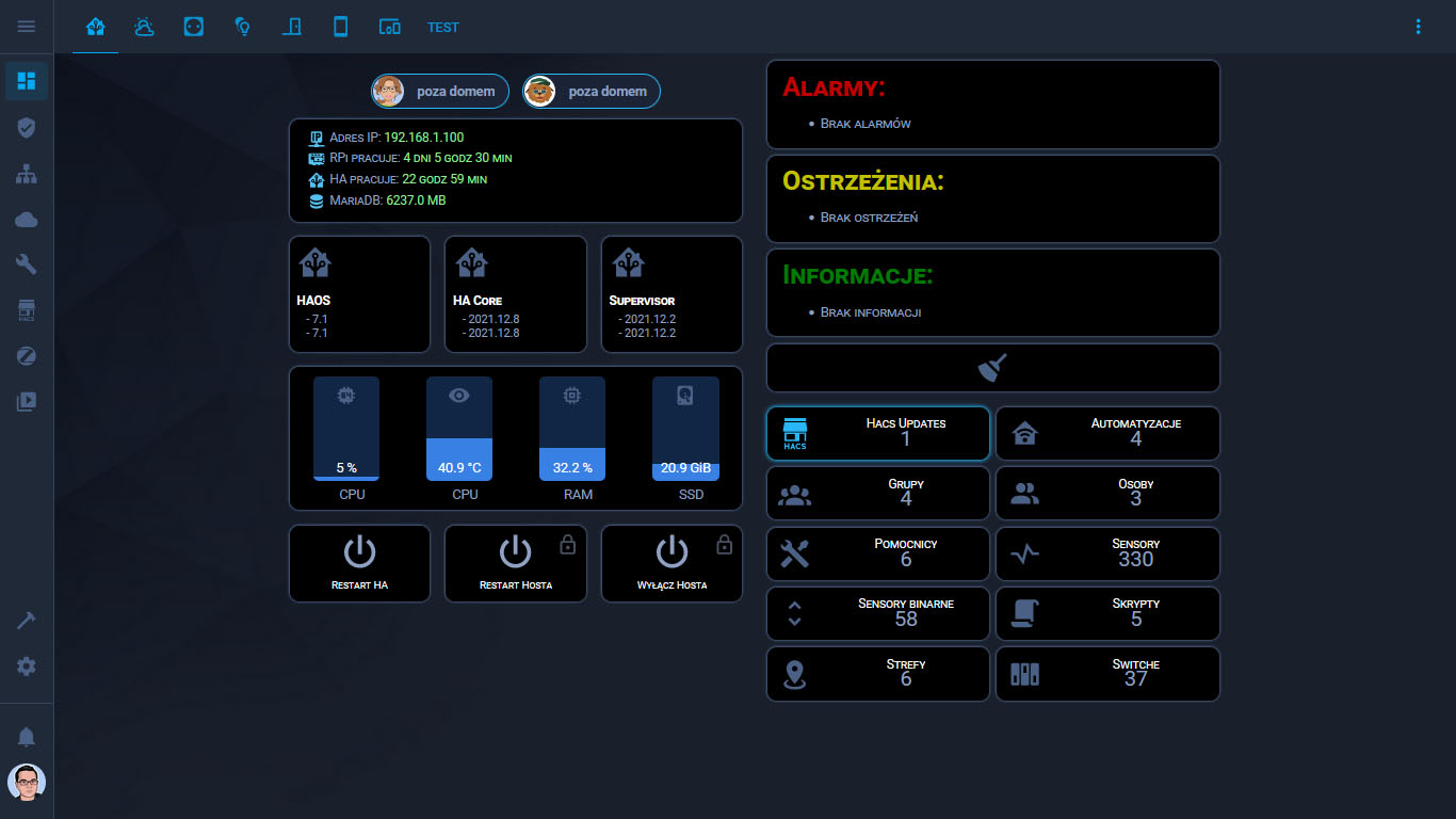
Inna kolorystyka za sprawą innego motywu, inny układ.
Jeżeli chodzi o kod do widocznych kart to przedstawia się tak:
type: vertical-stack
cards:
  - type: horizontal-stack
    cards:
      - type: custom:button-card
        template: vertical-divider-grey
      - type: custom:person-entity-card
        centered: true
        showAtHome: true
        entities:
          - person.malgosia
          - person.justynka
        style: |
          ha-card {
            height: 40px;
          }
      - type: custom:button-card
        template: vertical-divider-grey
  - type: horizontal-stack
    cards:
      - type: custom:button-card
        template: vertical-divider-grey
      - type: custom:button-card
        template: device_button
        tap_action:
          action: navigate
          navigation_path: /config/logs
        styles:
          card:
            - height: null
        custom_fields:
          jeden: |
            [[[
              return `<ha-icon
                icon="mdi:ip-network"
                style="width: 20px; height: 20px; color: rgb(85,193,241)">
                </ha-icon><span> Adres IP: <span style="color: lightgreen;">${states['sensor.ipv4'].state}</span></span>`
            ]]]
          dwa: |
            [[[
              return `<ha-icon
                icon="mdi:raspberry-pi"
                style="width: 20px; height: 20px; color: rgb(85,193,241)">
                </ha-icon><span> RPi pracuje: <span style="color: lightgreen;">${states['sensor.rpi_uptime'].state}</span></span>`
            ]]]
          trzy: |
            [[[
              return `<ha-icon
                icon="mdi:home-assistant"
                style="width: 20px; height: 20px; color: rgb(85,193,241)">
                </ha-icon><span> HA pracuje: <span style="color: lightgreen;">${states['sensor.ha_uptime'].state}</span></span>`
            ]]]
          cztery: |
            [[[
              return `<ha-icon
                icon="mdi:database"
                style="width: 20px; height: 20px; color: rgb(85,193,241)">
                </ha-icon><span> MariaDB: <span style="color: lightgreen;">${states['sensor.database_rozmiar'].state} MB</span></span>`
            ]]]
      - type: custom:button-card
        template: vertical-divider-grey
  - type: custom:button-card
    template: vertical-divider-grey
  - type: horizontal-stack
    cards:
      - type: custom:button-card
        template: vertical-divider-grey
      - type: custom:button-card
        entity: binary_sensor.home_assistant_operating_system_update_available
        icon: mdi:home-assistant
        template: ha_version_button
        name: HAOS
        hold_action:
          action: navigate
          navigation_path: /config/dashboard
        custom_fields:
          obecna: |
            [[[
              return `<span> - <span style='color: var(--text-color-sensor);'>${states['sensor.home_assistant_operating_system_version'].state}</span></span>`
            ]]]
          dostepna: |
            [[[
              return `<span> - <span style='color: var(--text-color-sensor);'>${states['sensor.home_assistant_operating_system_newest_version'].state}</span></span>`
            ]]]
      - type: custom:button-card
        template: vertical-divider-grey
      - type: custom:button-card
        entity: sensor.core_update
        icon: mdi:home-assistant
        template: ha_version_button
        name: HA Core
        hold_action:
          action: navigate
          navigation_path: /config/dashboard
        custom_fields:
          obecna: |
            [[[
              return `<span> - <span style='color: var(--text-color-sensor);'>${states['sensor.version_current'].state}</span></span>`
            ]]]
          dostepna: |
            [[[
              return `<span> - <span style='color: var(--text-color-sensor);'>${states['sensor.version_available'].state}</span></span>`
            ]]]
      - type: custom:button-card
        template: vertical-divider-grey
      - type: custom:button-card
        entity: sensor.supervisor_update
        icon: mdi:home-assistant
        template: ha_version_button
        name: Supervisor
        hold_action:
          action: navigate
          navigation_path: /config/dashboard
        custom_fields:
          obecna: |
            [[[
              return `<span> - <span style='color: var(--text-color-sensor);'>${states['sensor.supervisor_update'].attributes.current_version}</span></span>`
            ]]]
          dostepna: |
            [[[
              return `<span> - <span style='color: var(--text-color-sensor);'>${states['sensor.supervisor_update'].attributes.newest_version}</span></span>`
            ]]]
      - type: custom:button-card
        template: vertical-divider-grey
  - type: custom:button-card
    template: vertical-divider-grey
  - type: custom:stack-in-card
    cards:
      - type: horizontal-stack
        cards:
          - type: custom:bar-card
            entities:
              - entity: sensor.cpu_use
            entity_row: true
            name: CPU
            direction: up
            height: 100px
            width: 70px
            target: 1550
            unit_of_measurement: null
            positions:
              icon: inside
              indicator: 'off'
              value: inside
              name: outside
            severity:
              - from: 0
                to: 60
                color: rgba(57,128,228)
              - from: 61
                to: 85
                color: orange
              - from: 86
                to: 100
                color: red
            minmax: 'off'
            style: |
              ha-card {
                margin-top: 10px;
              }
              bar-card-value {
                color: white;
              }
          - type: custom:bar-card
            entities:
              - entity: sensor.cpu_temp
            entity_row: true
            name: CPU
            direction: up
            height: 100px
            width: 70px
            target: 1550
            positions:
              icon: inside
              indicator: 'off'
              value: inside
              name: outside
            severity:
              - from: 0
                to: 60
                color: rgba(57,128,228)
              - from: 61
                to: 85
                color: orange
              - from: 86
                to: 100
                color: red
            minmax: 'off'
            style: |
              ha-card {
                margin-top: 10px;
              }
              bar-card-value {
                color: white;
              }
          - type: custom:bar-card
            entities:
              - entity: sensor.memory_use_percent
            entity_row: true
            name: RAM
            direction: up
            height: 100px
            width: 70px
            target: 1550
            positions:
              icon: inside
              indicator: 'off'
              value: inside
              name: outside
            severity:
              - from: 0
                to: 50
                color: rgba(57,128,228)
              - from: 51
                to: 85
                color: orange
              - from: 86
                to: 100
                color: red
            minmax: 'off'
            style: |
              ha-card {
                margin-top: 10px;
              }
              bar-card-value {
                color: white;
              }
          - type: custom:bar-card
            entities:
              - entity: sensor.disk_use
            entity_row: true
            name: SSD
            direction: up
            height: 100px
            width: 70px
            max: 122
            target: 1550
            positions:
              icon: inside
              indicator: 'off'
              value: inside
              name: outside
            severity:
              - from: 0
                to: 90
                color: rgba(57,128,228)
              - from: 90
                to: 110
                color: orange
              - from: 110
                to: 122
                color: red
            minmax: 'off'
            style: |
              ha-card {
                margin-top: 10px;
              }
              bar-card-value {
                color: white;
              }
    style: |
      ha-card {
        margin-left: 9px;
        margin-right: 9px;
        box-shadow: 0px 0px 3px 1px var(--state-icon-color);
        height: 150px;
        border-radius: 10px;
        background-color: rgb(0,0,0)
      }
  - type: custom:button-card
    template: vertical-divider-grey
  - type: horizontal-stack
    cards:
      - type: horizontal-stack
        cards:
          - type: custom:button-card
            template: vertical-divider-grey
          - type: custom:button-card
            template: alert_button
            tap_action:
              action: call-service
              service: homeassistant.restart
            hold_action:
              action: navigate
              navigation_path: /config/server_control
            name: Restart HA
            icon: mdi:power
            styles:
              card:
                - box-shadow: 0px 0px 3px 1px var(--state-icon-color)
                - height: 80px
              name:
                - font-size: 11px
          - type: custom:button-card
            template: vertical-divider-grey
          - type: custom:button-card
            template: alert_button
            tap_action:
              action: call-service
              service: hassio.host_reboot
            name: Restart Hosta
            icon: mdi:power
            lock:
              enabled:
                - - - return entity.state === 'on';
              unlock: hold
              exemptions:
                - username: Mariusz
            styles:
              card:
                - box-shadow: 0px 0px 3px 1px var(--state-icon-color)
                - height: 80px
              name:
                - font-size: 11px
          - type: custom:button-card
            template: vertical-divider-grey
          - type: custom:button-card
            template: alert_button
            tap_action:
              action: call-service
              service: hassio.host_shutdown
            name: Wyłącz Hosta
            icon: mdi:power
            lock:
              enabled:
                - - - return entity.state === 'on';
              unlock: hold
              exemptions:
                - username: Mariusz
            styles:
              card:
                - box-shadow: 0px 0px 3px 1px var(--state-icon-color)
                - height: 80px
              name:
                - font-size: 11px
          - type: custom:button-card
            template: vertical-divider-grey
type: vertical-stack
cards:
  - type: markdown
    content: |-
      # <font color='#c00000'>Alarmy:</font>
      {% for i in states.input_select.alarmy.attributes.options %}
      -  {{i }}
      {%- endfor %}
    style: |
      ha-card {
        margin-left: 9px;
        margin-right: 9px;
        box-shadow: 0px 0px 3px 1px var(--state-icon-color);
        font-variant: small-caps;
        background: rgb(0,0,0);
        border-radius: 10px
      }
  - type: markdown
    content: |-
      #  <font color='#c1c100'>Ostrzeżenia:</font>
      {% for i in states.input_select.ostrzezenia.attributes.options %}
      -  {{i }}
      {%- endfor %}
    style: |
      ha-card {
        margin-left: 9px;
        margin-right: 9px;
        box-shadow: 0px 0px 3px 1px var(--state-icon-color);
        font-variant: small-caps;
        background: rgb(0,0,0);
        border-radius: 10px
      }
  - type: markdown
    content: |-
      #  <font color='#007a00'>Informacje:</font>
      {% for i in states.input_select.informacje.attributes.options %}
      -  {{i }}
      {%- endfor %}
    style: |
      ha-card {
        margin-left: 9px;
        margin-right: 9px;
        box-shadow: 0px 0px 3px 1px var(--state-icon-color);
        font-variant: small-caps;
        background: rgb(0,0,0);
        border-radius: 10px
      }
  - type: button
    entity: input_boolean.wyczysc_alarmy_i_ostrzezenia
    show_name: false
    icon_height: 40px
    style: |
      ha-card {
        margin-left: 9px;
        margin-right: 9px;
        box-shadow: 0px 0px 3px 1px var(--state-icon-color);
        font-variant: small-caps;
        background: rgb(0,0,0);
        max-height: 50px;
        border-radius: 10px
      }
  - type: custom:button-card
    template: vertical-divider-grey
  - type: horizontal-stack
    cards:
      - type: custom:button-card
        template: vertical-divider-grey
      - type: custom:button-card
        entity: sensor.hacs
        name: Hacs Updates
        hold_action:
          action: navigate
          navigation_path: /hacs
        show_name: true
        layout: icon_state_name2nd
        styles:
          grid:
            - grid-template-areas: '"i n" "i s" "i ilosc"'
            - grid-template-columns: 1fr 75%
          card:
            - height: 55px
            - font-size: 22px
            - background-color: black
            - border-radius: 10px
            - box-shadow: >
                [[[ if (entity.state > '0') return '0px 0px 5px 1px
                var(--primary-color)';
                      return '0px 0px 3px 1px var(--state-icon-color)';
                ]]]
            - font-variant: small-caps
          icon:
            - color: |
                [[[
                  if (entity.state > '0') return 'var(--primary-color)';
                  return 'var(--state-icon-color)';
                ]]]
            - width: 60%
          name:
            - font-size: 13px
            - color: White
        custom_fields:
          ilosc: |
            [[[
              return `<span style='color: var(--text-color-sensor);'>${entity.state}</span>`
            ]]]
      - type: custom:button-card
        entity: sensor.automatyzacje
        template: count_button
        hold_action:
          action: navigate
          navigation_path: /config/automation/dashboard
      - type: custom:button-card
        template: vertical-divider-grey
  - type: horizontal-stack
    cards:
      - type: custom:button-card
        template: vertical-divider-grey
      - type: custom:button-card
        entity: sensor.grupy
        template: count_button
        hold_action:
          action: navigate
          navigation_path: /config/entities
      - type: custom:button-card
        entity: sensor.osoby
        template: count_button
        hold_action:
          action: navigate
          navigation_path: /config/person
      - type: custom:button-card
        template: vertical-divider-grey
  - type: horizontal-stack
    cards:
      - type: custom:button-card
        template: vertical-divider-grey
      - type: custom:button-card
        entity: sensor.pomocnicy
        template: count_button
        hold_action:
          action: navigate
          navigation_path: /config/helpers
      - type: custom:button-card
        entity: sensor.sensory
        template: count_button
        hold_action:
          action: navigate
          navigation_path: /config/entities
      - type: custom:button-card
        template: vertical-divider-grey
  - type: horizontal-stack
    cards:
      - type: custom:button-card
        template: vertical-divider-grey
      - type: custom:button-card
        entity: sensor.sensory_binarne
        template: count_button
        hold_action:
          action: navigate
          navigation_path: /config/entities
      - type: custom:button-card
        entity: sensor.skrypty
        template: count_button
        hold_action:
          action: navigate
          navigation_path: /config/script/dashboard
      - type: custom:button-card
        template: vertical-divider-grey
  - type: horizontal-stack
    cards:
      - type: custom:button-card
        template: vertical-divider-grey
      - type: custom:button-card
        entity: sensor.strefy
        template: count_button
        hold_action:
          action: navigate
          navigation_path: /config/zone
      - type: custom:button-card
        entity: sensor.switche
        template: count_button
        hold_action:
          action: navigate
          navigation_path: /config/entities
      - type: custom:button-card
        template: vertical-divider-grey
a ponieważ korzystam z buuton-card templates, to jeszcze potrzebne będzie:
button_card_templates:
  vertical-divider-grey:
    color_type: blank-card
    styles:
      card:
        - width: 1px
        - color: '#292929'
  alert_button:
    state:
      - value: 'on'
        styles:
          card:
            - box-shadow: 0px 0px 5px 1px var(--primary-color)
    styles:
      card:
        - height: 97px
        - background-color: black
        - border-radius: 10px
        - padding: 5%
        - font-size: 22px
        - box-shadow: 0px 0px 3px 1px var(--state-icon-color)
        - font-variant: small-caps
      grid:
        - grid-template-areas: '"i i" "n n" "s s"'
        - grid-template-columns: 1fr 1fr
        - grid-template-rows: 1fr min-content min-content
      name:
        - font-size: 13px
        - color: White
        - align-self: middle
        - justify-self: middle
        - padding-bottom: 4px
      state:
        - font-size: 15px
      img_cell:
        - justify-content: middle
        - align-items: middle
        - margin: none
      icon:
        - width: 40%
        - margin-top: '-5%'
  count_button:
    show_state: true
    show_name: true
    layout: icon_state_name2nd
    styles:
      grid:
        - grid-template-areas: '"i n" "i s" "i l"'
        - grid-template-columns: 1fr 75%
      card:
        - height: 55px
        - font-size: 22px
        - background-color: black
        - border-radius: 10px
        - box-shadow: 0px 0px 3px 1px var(--state-icon-color)
        - font-variant: small-caps
      icon:
        - color: var(--state-icon-color)
        - width: 60%
      name:
        - font-size: 13px
        - color: White
      state:
        - margin-top: '-30px'
  device_button:
    styles:
      card:
        - height: 210px
        - background-color: rgb(0,0,0)
        - box-shadow: 0px 0px 3px 1px var(--state-icon-color)
        - border-radius: 10px
        - padding: 2%
        - font-variant: small-caps
      grid:
        - grid-template-areas: >-
            "i topright" "bar bar" "jeden jeden" "dwa dwa" "trzy trzy" "cztery
            cztery" "piec topleft" "szesc szesc" "siedem siedem" "osiem osiem"
        - grid-template-columns: 1fr
        - grid-template-rows: >-
            1fr min-content min-content min-content min-content min-content
            min-content min-content min-content min-content
      img_cell:
        - justify-content: start
        - align-items: start
        - padding-bottom: 1%
      icon:
        - width: 33%
        - margin-top: 2%
        - margin-left: 35%
        - color: rgb(0,122,255)
      custom_fields:
        jeden:
          - margin-left: 2%
          - padding-bottom: 2px
          - align-self: middle
          - justify-self: start
          - font-size: 13px
        dwa:
          - margin-left: 2%
          - padding-bottom: 2px
          - align-self: middle
          - justify-self: start
          - font-size: 13px
        trzy:
          - margin-left: 2%
          - padding-bottom: 2px
          - align-self: middle
          - justify-self: start
          - font-size: 13px
        cztery:
          - margin-left: 2%
          - padding-bottom: 2px
          - align-self: middle
          - justify-self: start
          - font-size: 13px
        piec:
          - margin-left: 2%
          - padding-bottom: 2px
          - align-self: middle
          - justify-self: start
          - font-size: 13px
        szesc:
          - margin-left: 2%
          - padding-bottom: 2px
          - align-self: middle
          - justify-self: start
          - font-size: 13px
        siedem:
          - margin-left: 2%
          - padding-bottom: 2px
          - align-self: middle
          - justify-self: start
          - font-size: 13px
        osiem:
          - margin-left: 2%
          - padding-bottom: 2px
          - align-self: middle
          - justify-self: start
          - font-size: 13px
        topright:
          - position: absolute
          - right: 5%
          - top: 5%
          - font-size: 14px
          - height: 100px
        topleft:
          - position: absolute
          - left: 1px
          - top: 1px
          - width: 97%
          - margin-top: '-3%'
        bar:
          - padding-left: 5px
          - padding-right: 5px
          - '--ha-card-background': rgba(0, 0, 0, 0.0)
  ha_version_button:
    state:
      - value: 'on'
        styles:
          card:
            - box-shadow: 0px 0px 5px 1px var(--primary-color)
    styles:
      card:
        - height: 120px
        - background-color: black
        - border-radius: 10px
        - padding: 5%
        - font-size: 12px
        - text-transform: capitalize
        - box-shadow: 0px 0px 3px 1px var(--state-icon-color)
        - font-variant: small-caps
      grid:
        - grid-template-areas: '"i i" "n n" "obecna obecna" "dostepna dostepna" '
        - grid-template-columns: 1fr 1fr
        - grid-template-rows: 1fr min-content min-content min-content min-content
      name:
        - font-weight: bold
        - font-size: 13px
        - color: White
        - align-self: middle
        - justify-self: start
        - padding-bottom: 4px
      img_cell:
        - justify-content: start
        - align-items: start
        - margin: none
      icon:
        - color: |
            [[[
              if (entity.state == 'on') return 'var(--primary-color)';
              return 'var(--state-icon-color)';
            ]]]
        - width: 30%
        - margin-top: '-5%'
      custom_fields:
        obecna:
          - align-self: start
          - justify-self: start
          - margin-left: 10px
        dostepna:
          - padding-bottom: 5px
          - align-self: start
          - justify-self: start
          - margin-left: 10px
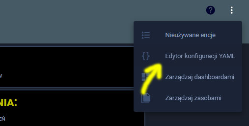
Te button-card templates trzeba wpisać do pliku konfiguracji Lovelace, klikając kolejno w trzy kropki a potem w pozycję zaznaczoną strzałką.
Najlepiej wpisać od razu bezpośrednio pod pierwszą linijką z pliku:
title: Home Assistant
Motyw jakiego używam to ten podany poniżej, chociaż częściowo też zmodyfikowany pod moje potrzeby: