Witam wszystkich serdecznie.
button_card_templates: !include_dir_merge_named minimalist-templates/
views:
- title: Minimalist
cards:
- type: horizontal-stack
cards:
- type: custom:button-card
template: edge
- type: custom:button-card
template: title
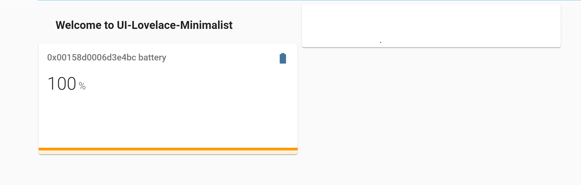
name: Welcome to UI-Lovelace-Minimalist
- type: custom:button-card
template: edge
- type: custom:mini-graph-card
entities:
- sensor.0x00158d0006d3e4bc_battery
- type: 'custom:button-card'
template: card_light_slider
variables:
ulm_card_light_slider_name: Light
entity: light.0x00178801099f4f73
styles:
icon:
- color: 'rgb(192,192,192)'
state:
- value: 'on'
styles:
icon:
- color: 'rgb(255,255,153)'
Efekt:
Sprawdź
  styles:
  state:
    - value: 'on'
      styles:
        icon:
          - color: 'rgb(255,255,153)'
  state:
    - value: 'off'
      styles:
        icon:
          - color: 'rgb(255,255,255)'
bez drugiego state
button_card_templates: !include_dir_merge_named minimalist-templates/
views:
  - title: Minimalist
    cards:
      - type: horizontal-stack
        cards:
          - type: custom:button-card
            template: edge
          - type: custom:button-card
            template: title
            name: Welcome to UI-Lovelace-Minimalist
          - type: custom:button-card
            template: edge
      - type: custom:mini-graph-card
        entities:
          - sensor.0x00158d0006d3e4bc_battery
      - type: 'custom:button-card'
        template: card_light_slider
        variables:
          ulm_card_light_slider_name: Light
        entity: light.0x00178801099f4f73
        styles:
        state:
          - value: 'on'
            styles:
              icon:
                - color: 'rgb(255,255,153)'
          - value: 'off'
            styles:
              icon:
                - color: 'rgb(255,255,255)'
MariuszT
19 Styczeń 2022 17:50
4
Pokaż zawartość template: card_light_slider
card_light_slider:
  template:
    - "ulm_language_variables"
  variables:
    ulm_card_light_slider_name: "[[[ return entity.attributes.friendly_name ]]]"
  show_icon: false
  show_name: false
  show_label: false
  state:
    - operator: "template"
      value: "[[[ return entity.state == 'on' ]]]"
      styles:
        card:
          - background-color: "rgba(var(--color-background-yellow),var(--opacity-bg))"
  styles:
    grid:
      - grid-template-areas: "'item1' 'item2'"
      - grid-template-columns: "1fr"
      - grid-template-rows: "min-content min-content"
      - row-gap: "12px"
    card:
      - border-radius: "var(--border-radius)"
      - box-shadow: "var(--box-shadow)"
      - padding: "12px"
  custom_fields:
    item1:
      card:
        type: "custom:button-card"
        template:
          - "icon_info"
          - "yellow_slider"
        entity: "[[[ return entity.entity_id ]]]"
        label: >-
          [[[
            if (entity.state !="unavailable"){
              if (entity.state =="off"){
                return variables.ulm_off;
              } else if (entity.state == "on"){
                if (entity.attributes.brightness != null){
                  var bri = Math.round(entity.attributes.brightness / 2.55);
                  return (bri ? bri : "0") + "%";
                } else {
                  return variables.ulm_on
                }
              }
            } else {
              return variables.ulm_unavailable;
            }
          ]]]
        name: "[[[ return variables.ulm_card_light_slider_name ]]]"
        styles:
          card:
            - box-shadow: "none"
            - border-radius: "var(--border-radius) var(--border-radius) var(--border-radius) var(--border-radius)"
            - padding: "0px"
    item2:
      card:
        type: "custom:my-slider"
        entity: "[[[ return entity.entity_id ]]]"
        radius: "14px"
        height: "42px"
        mainSliderColor: >-
          [[[
            if (entity.state == "unavailable"){
              return "rgba(var(--color-grey),1)";
            }
            return "rgba(var(--color-yellow),1)";
          ]]]
        secondarySliderColor: >-
          [[[
            if (entity.state == "unavailable"){
              return "rgba(var(--color-grey),0.2)";
            }
            return "rgba(var(--color-yellow),0.2)";
          ]]]
        mainSliderColorOff: "rgba(var(--color-theme),0.05)"
        secondarySliderColorOff: "rgba(var(--color-theme),0.05)"
        thumbHorizontalPadding: "0px"
        thumbVerticalPadding: "0px"
        thumbWidth: "0px"
        card_mod:
        style: |
          ha-card {
            border-radius: 14px;
            box-shadow: none;
          }
MariuszT
19 Styczeń 2022 17:57
6
Deklarujesz w template brak ikony, po czym chcesz zmieniać jej kolor?
show_icon: false
Jacek_Bolesta:
        styles:
          icon:
            - color: 'rgb(192,192,192)'
        state:
          - value: 'on'
            styles:
              icon:
                - color:  'rgb(255,255,153)'
OK. Template użyłem domyślny z minimalist.
MariuszT
19 Styczeń 2022 18:25
8
Wyklucz na początek całkowicie template, bo inaczej nie dojdziemy do niczego.
      - type: 'custom:button-card'
        entity: light.0x00178801099f4f73
        state:
          - value: 'on'
            styles:
              icon:
                - color: 'rgb(255,255,153)'
          - value: 'off'
            styles:
              icon:
                - color: 'rgb(255,255,255)'
Tak jest OK…
MariuszT
19 Styczeń 2022 18:50
10
Temples z których korzystasz sam tworzyłeś czy to jakieś gotowce. W tym pierwszym, którego zawartość pokazałeś nie było zadeklarowanej ikony, stąd brak jej obsługi.
  light_button:
    show_last_changed: true
    styles:
      card:
        - height: 110px
        - border-radius: 10px
        - background-color: black
        - font-variant: small-caps
        - padding: 5%
      icon:
        - height: 62%
        - margin-left: '-12%'
        - margin-top: '-12%'
      img_cell:
        - justify-content: start
      grid:
        - grid-template-areas: '"i" "n" "s" "l"'
        - grid-template-rows: 1fr min-content min-content min-content
      label:
        - color: gray
        - font-size: 11px
        - justify-self: start
      name:
        - font-size: 14px
        - font-weight: bold
        - justify-self: start
Po za tym, w tym template: card_light_slider pojawiają się kolejne templates podczas deklaracji cistom_fields. Za duża gmatwanina.
Edit:
        template:
          - "icon_info"
czyli tam trzeba szukać rozwiązania. Co nie zmienia faktu że ktoś to za bardzo zagmatwał.