Kod zaciągnięty z Forum HA/mushroom

Wiem że nie jest to custom:button-card ale przejrzyj kod.
type: custom:stack-in-card
cards:
  - type: custom:mushroom-media-player-card
    entity: media_player.spotify_pc_artur
    icon: mdi:play
    use_media_info: true
    use_media_artwork: false
    show_volume_level: false
    media_controls:
      - play_pause_stop
      - previous
      - next
    volume_controls:
      - volume_buttons
      - volume_set
    fill_container: false
    card_mod:
      style: |
        mushroom-shape-icon {
          display: flex;
          {% set media_type = state_attr(config.entity, 'media_content_type') %}
          {% if media_type == 'tvshow' %}
            --card-mod-icon: mdi:television-classic;
            animation: flicker 1s linear infinite alternate;
          {% elif media_type == 'movie' %}
            --card-mod-icon: mdi:movie-roll;
            animation: spin 2s linear infinite reverse;
          {% elif media_type == 'music' %}
            --card-mod-icon: mdi:music;
            animation: beat 1.3s ease-out infinite both;
          {% elif media_type == 'playlist' %}
            --card-mod-icon: mdi:music;
            animation: beat 1.3s ease-out infinite both;
          {% else %}
            --card-mod-icon: mdi:play;
          {% endif %}

          {{ 'animation: none;' if not is_state(config.entity, 'playing') }}

        }
        @keyframes flicker {
          0%, 31.98%, 32.98%, 34.98%, 36.98%, 39.98%, 67.98%, 68.98%, 95.98%, 96.98%, 97.98%, 98.98%, 100% { --icon-color: rgba(var(--album-art-color), 1); }
          32%, 33%, 35%, 36%, 37%, 40%, 68%, 69%, 96%, 97%, 98%, 99% { --icon-color: rgba(var(--album-art-color), 0.6); }
        }
        @keyframes beat {
          0%, 60% { --icon-symbol-size: 21px; }
          5%, 17%, 57% { --icon-symbol-size: 22px; }
          10%, 20%, 51% { --icon-symbol-size: 23px; }
          25%, 45% { --icon-symbol-size: 24px; }
          30%, 39% { --icon-symbol-size: 25px; }
          33% { --icon-symbol-size: 26px; }
        }
        ha-card {
          --ha-card-border-width: 0;
          --rgb-state-media-player: var(--album-art-color);
        }
        .actions {
          --rgb-primary-text-color: var(--album-art-color);
          --primary-text-color: rgb(var(--album-art-color));
        }
        ha-card:before {
          transform: translate3d(0,0,0);
          -webkit-transform: translate3d(0,0,0);
          content: "";

          background: url('/local/idle_art.png') center no-repeat;
          {% if not is_state(config.entity, 'idle') and not is_state(config.entity, 'off') %}
            background: url( '{{ state_attr(config.entity, "entity_picture") }}') center no-repeat;
          {% endif %}

          background-size: contain;
          margin: 4px 4px 16px;
          filter: drop-shadow(4px 4px 6px rgba(0, 0, 0, 0.5));
          border-radius: var(--control-border-radius);

          {% set media_type = state_attr(config.entity, 'media_content_type') %}
          {% if media_type == 'tvshow' %}
            aspect-ratio: 16 / 9;
          {% elif media_type == 'movie' %}
            aspect-ratio: 2 / 3;
          {% else %}
            aspect-ratio: 1 / 1;
          {% endif %}
        }
  - type: conditional
    conditions:
      - entity: media_player.spotify_pc_artur
        state_not: 'off'
      - entity: media_player.spotify_pc_artur
        state_not: idle
    card:
      entity: media_player.spotify_pc_artur
      hide:
        icon: true
        name: true
        runtime: true
        source: true
        power: true
        state_label: true
        volume: true
        info: true
        progress: false
        controls: true
      more_info: false
      type: custom:mini-media-player
      toggle_power: false
      group: true
      card_mod:
        style:
          mmp-progress$: |
            paper-progress {
              {% if is_state(config.entity, 'playing') %}
                --paper-progress-container-color: rgba(var(--album-art-color), 0.2) !important;
              {% endif %}
            }
          .: |
            ha-card {
              margin: 0px 12px 12px;
              --mmp-progress-height: 12px !important;
              height: var(--mmp-progress-height);
              --mmp-accent-color: rgb(var(--album-art-color));
              --mmp-border-radius: 12px !important;
              --ha-card-border-width: 0;
            }
card_mod:
  style: |
    ha-card:before {
      transform: translate3d(0,0,0);
      -webkit-transform: translate3d(0,0,0);
      content: "";
      position: absolute;
      height: 100%;
      width: 100%;

      background: url('/local/idle_art.png') center no-repeat;
      {% if not is_state('media_player.spotify_pc_artur', 'idle') and not is_state('media_player.spotify_pc_artur', 'off') %}
        background: url( '{{ state_attr('media_player.spotify_pc_artur', "entity_picture") }}' ) center no-repeat;
      {% endif %}

      filter: blur(150px) saturate(200%);
      background-size: 100% 100%;
    }
    ha-card {
      transform: translate3d(0,0,0);
      -webkit-transform: translate3d(0,0,0);
    }
    :host {
      --album-art-color:
      {% if not is_state('media_player.spotify_pc_artur', 'idle') and not is_state('media_player.spotify_pc_artur', 'off') %}
        {{ states('sensor.muted_color') }}
      {% else %}
        var(--rgb-indigo-color)
      {% endif %};
    }
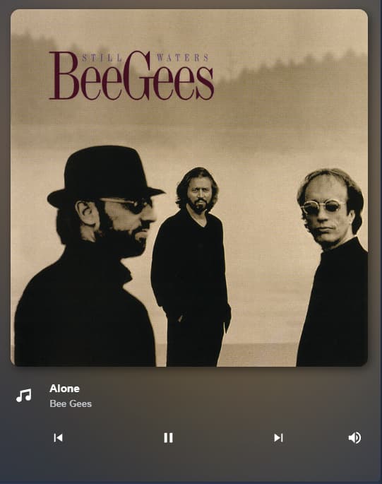
Ten kawałek
card_mod:
  style: |
    ha-card:before {
      transform: translate3d(0,0,0);
      -webkit-transform: translate3d(0,0,0);
      content: "";
      position: absolute;
      height: 100%;
      width: 100%;

      background: url('/local/idle_art.png') center no-repeat;
      {% if not is_state('media_player.spotify_pc_artur', 'idle') and not is_state('media_player.spotify_pc_artur', 'off') %}
        background: url( '{{ state_attr('media_player.spotify_pc_artur', "entity_picture") }}' ) center no-repeat;
      {% endif %}

      filter: blur(150px) saturate(200%);
      background-size: 100% 100%;
    }
    ha-card {
      transform: translate3d(0,0,0);
      -webkit-transform: translate3d(0,0,0);
    }
    :host {
      --album-art-color:
      {% if not is_state('media_player.spotify_pc_artur', 'idle') and not is_state('media_player.spotify_pc_artur', 'off') %}
        {{ states('sensor.muted_color') }}
      {% else %}
        var(--rgb-indigo-color)
      {% endif %};
    }