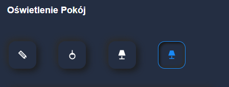
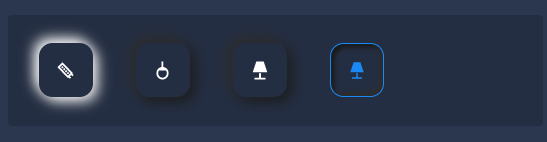
Gdyby ktoś potrzebował opanowałem do takiego stopnia 
type: vertical-stack
cards:
- type: custom:button-card
color_type: label-card
color: rgb(35, 35, 35)
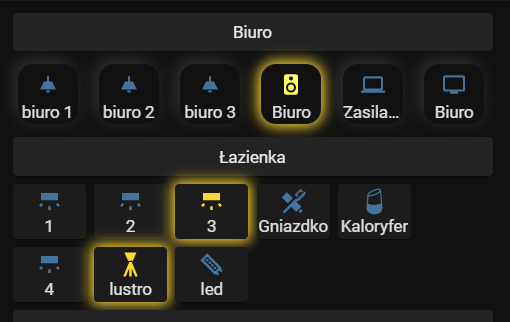
name: Biuro
styles:
card:
- height: 1px
- type: grid
columns: 6
cards:
- type: custom:button-card
entity: light.biuro_1
icon: mdi:ceiling-light
state:
- value: 'on'
styles:
card:
- '-webkit-box-shadow': 0 0 0.95rem 0.2rem var(--button-card-light-color)
- box-shadow: 0 0 0.95rem 0.2rem var(--button-card-light-color)
- transition: all 2s ease
style: |
ha-card:hover {
transform: scale(1.05);
box-shadow: 0 0 10px;
}
hold_action:
action: more-info
- type: custom:button-card
entity: light.biuro_2
icon: mdi:ceiling-light
state:
- value: 'on'
styles:
card:
- '-webkit-box-shadow': 0 0 0.95rem 0.2rem var(--button-card-light-color)
- box-shadow: 0 0 0.95rem 0.2rem var(--button-card-light-color)
- transition: all 2s ease
style: |
ha-card:hover {
transform: scale(1.05);
box-shadow: 0 0 10px;
}
hold_action:
action: more-info
- type: custom:button-card
entity: light.biuro_3
icon: mdi:ceiling-light
state:
- value: 'on'
styles:
card:
- '-webkit-box-shadow': 0 0 0.95rem 0.2rem var(--button-card-light-color)
- box-shadow: 0 0 0.95rem 0.2rem var(--button-card-light-color)
- transition: all 2s ease
style: |
ha-card:hover {
transform: scale(1.05);
box-shadow: 0 0 10px;
}
hold_action:
action: more-info
- type: custom:button-card
entity: switch.officepowersocket
name: Biuro
color: rgb(255, 255, 100)
icon: mdi:printer
state:
- value: 'on'
styles:
card:
- '-webkit-box-shadow': 0 0 0.95rem 0.2rem var(--button-card-light-color)
- box-shadow: 0 0 0.95rem 0.2rem rgb(255,132,19)
- transition: all 2s ease
style: |
ha-card:hover {
transform: scale(1.05);
box-shadow: 0 0 10px;
}
hold_action:
action: more-info
- type: custom:button-card
entity: switch.officelaptoppowersocket
name: Zasilacz
color: rgb(255, 255, 100)
icon: mdi:laptop
state:
- value: 'on'
styles:
card:
- '-webkit-box-shadow': 0 0 0.95rem 0.2rem var(--button-card-light-color)
- box-shadow: 0 0 0.95rem 0.2rem rgb(255,132,19)
- transition: all 2s ease
style: |
ha-card:hover {
transform: scale(1.05);
box-shadow: 0 0 10px;
}
hold_action:
action: more-info
- type: custom:button-card
entity: switch.gniazdko_tv_biuro
name: Biuro
color: rgb(255, 255, 100)
icon: mdi:television
state:
- value: 'on'
styles:
card:
- '-webkit-box-shadow': 0 0 0.95rem 0.2rem var(--button-card-light-color)
- box-shadow: 0 0 0.95rem 0.2rem rgb(255,132,19)
- transition: all 2s ease
style: |
ha-card:hover {
transform: scale(1.05);
box-shadow: 0 0 10px;
}
hold_action:
action: more-info
square: false
- type: custom:button-card
color_type: label-card
color: rgb(35, 35, 35)
name: Łazienka
styles:
card:
- height: 1px
- type: grid
cards:
- type: grid
columns: 3
cards:
- type: custom:button-card
entity: light.lazienka_gorna_1
name: 1
state:
- value: 'on'
styles:
card:
- '-webkit-box-shadow': 0 0 0.95rem 0.2rem var(--button-card-light-color)
- box-shadow: 0 0 0.95rem 0.2rem var(--button-card-light-color)
- transition: all 2s ease
style: |
ha-card:hover {
transform: scale(1.05);
box-shadow: 0 0 10px;
}
hold_action:
action: more-info
- type: custom:button-card
entity: light.lazienka_gorna_2
name: 2
state:
- value: 'on'
styles:
card:
- '-webkit-box-shadow': 0 0 0.95rem 0.2rem var(--button-card-light-color)
- box-shadow: 0 0 0.95rem 0.2rem var(--button-card-light-color)
- transition: all 2s ease
style: |
ha-card:hover {
transform: scale(1.05);
box-shadow: 0 0 10px;
}
hold_action:
action: more-info
- type: custom:button-card
entity: light.lazienka_gorna_3
name: 3
state:
- value: 'on'
styles:
card:
- '-webkit-box-shadow': 0 0 0.95rem 0.2rem var(--button-card-light-color)
- box-shadow: 0 0 0.95rem 0.2rem var(--button-card-light-color)
- transition: all 2s ease
style: |
ha-card:hover {
transform: scale(1.05);
box-shadow: 0 0 10px;
}
hold_action:
action: more-info
- type: custom:button-card
entity: light.lazienka_gorna_4
name: 4
state:
- value: 'on'
styles:
card:
- '-webkit-box-shadow': 0 0 0.95rem 0.2rem var(--button-card-light-color)
- box-shadow: 0 0 0.95rem 0.2rem var(--button-card-light-color)
- transition: all 2s ease
style: |
ha-card:hover {
transform: scale(1.05);
box-shadow: 0 0 10px;
}
hold_action:
action: more-info
- type: custom:button-card
entity: light.lustro_lazienka_gorna
name: lustro
state:
- value: 'on'
styles:
card:
- '-webkit-box-shadow': 0 0 0.95rem 0.2rem var(--button-card-light-color)
- box-shadow: 0 0 0.95rem 0.2rem var(--button-card-light-color)
- transition: all 2s ease
style: |
ha-card:hover {
transform: scale(1.05);
box-shadow: 0 0 10px;
}
hold_action:
action: more-info
- type: custom:button-card
entity: light.led_lazienka_gorna
name: led
state:
- value: 'on'
styles:
card:
- '-webkit-box-shadow': 0 0 0.95rem 0.2rem var(--button-card-light-color)
- box-shadow: 0 0 0.95rem 0.2rem rgb(230, 230, 230)
- transition: all 2s ease
style: |
ha-card:hover {
transform: scale(1.05);
box-shadow: 0 0 10px;
}
hold_action:
action: more-info
square: false
- type: grid
columns: 3
cards:
- type: custom:button-card
entity: switch.gniazdko_lazienka
name: Gniazdko
color: rgb(255, 255, 100)
icon: mdi:toothbrush-paste
state:
- value: 'on'
styles:
card:
- '-webkit-box-shadow': 0 0 0.95rem 0.2rem var(--button-card-light-color)
- box-shadow: 0 0 0.95rem 0.2rem rgb(44, 109, 214)
- transition: all 2s ease
style: |
ha-card:hover {
transform: scale(1.05);
box-shadow: 0 0 10px;
}
hold_action:
action: more-info
- type: custom:button-card
entity: switch.kaloryfer_lazienka_gorna
name: Kaloryfer
color: rgb(255, 255, 100)
icon: mdi:google-home
state:
- value: 'on'
styles:
card:
- '-webkit-box-shadow': 0 0 0.95rem 0.2rem var(--button-card-light-color)
- box-shadow: 0 0 0.95rem 0.2rem rgb(44, 109, 214)
- transition: all 2s ease
style: |
ha-card:hover {
transform: scale(1.05);
box-shadow: 0 0 10px;
}
hold_action:
action: more-info
square: false
columns: 2
square: false
- type: custom:button-card
color_type: label-card
color: rgb(35, 35, 35)
name: Sypialnia i garderoba
styles:
card:
- height: 1px
- type: grid
cards:
- type: grid
columns: 3
cards:
- type: custom:button-card
entity: light.sypialnia_1
name: Światło
state:
- value: 'on'
styles:
card:
- '-webkit-box-shadow': 0 0 0.95rem 0.2rem var(--button-card-light-color)
- box-shadow: 0 0 0.95rem 0.2rem var(--button-card-light-color)
- transition: all 2s ease
style: |
ha-card:hover {
transform: scale(1.05);
box-shadow: 0 0 10px;
}
hold_action:
action: more-info
- type: custom:button-card
entity: light.iwona_sypialnia
name: Iwona
state:
- value: 'on'
styles:
card:
- '-webkit-box-shadow': 0 0 0.95rem 0.2rem var(--button-card-light-color)
- box-shadow: 0 0 0.95rem 0.2rem var(--button-card-light-color)
- transition: all 2s ease
style: |
ha-card:hover {
transform: scale(1.05);
box-shadow: 0 0 10px;
}
hold_action:
action: more-info
- type: custom:button-card
entity: light.badroom_m_light_wall
name: Marcin
state:
- value: 'on'
styles:
icon:
- color: var(--button-card-light-color)
card:
- '-webkit-box-shadow': 0px 0px 9px 3px var(--button-card-light-color)
- box-shadow: 0px 0px 9px 3px var(--button-card-light-color)
style: |
ha-card:hover {
transform: scale(1.05);
box-shadow: 0 0 10px;
}
hold_action:
action: more-info
- type: custom:button-card
entity: light.garderoba_sypialnia
name: Garderoba
state:
- value: 'on'
styles:
card:
- '-webkit-box-shadow': 0 0 0.95rem 0.2rem var(--button-card-light-color)
- box-shadow: 0 0 0.95rem 0.2rem var(--button-card-light-color)
- transition: all 2s ease
style: |
ha-card:hover {
transform: scale(1.05);
box-shadow: 0 0 10px;
}
hold_action:
action: more-info
square: false
- type: grid
columns: 3
cards:
- type: custom:button-card
entity: switch.gniazdko_tv_sypialnia
name: Telewizor
color: rgb(255, 255, 100)
state:
- value: 'on'
styles:
card:
- '-webkit-box-shadow': 0 0 0.95rem 0.2rem var(--button-card-light-color)
- box-shadow: 0 0 0.95rem 0.2rem rgb(81,188,165)
- transition: all 2s ease
style: |
ha-card:hover {
transform: scale(1.05);
box-shadow: 0 0 10px;
}
hold_action:
action: more-info
square: false
columns: 2
square: false
- type: custom:button-card
color_type: label-card
color: rgb(35, 35, 35)
name: Julia
styles:
card:
- height: 20px
- type: grid
cards:
- type: grid
columns: 3
cards:
- type: custom:button-card
entity: light.julia_1
name: Światło
state:
- value: 'on'
styles:
card:
- '-webkit-box-shadow': 0 0 0.95rem 0.2rem var(--button-card-light-color)
- box-shadow: 0 0 0.95rem 0.2rem var(--button-card-light-color)
- transition: all 2s ease
style: |
ha-card:hover {
transform: scale(1.05);
box-shadow: 0 0 10px;
}
hold_action:
action: more-info
- type: custom:button-card
entity: light.juliawall
name: Nocna
state:
- value: 'on'
styles:
icon:
- color: var(--button-card-light-color)
card:
- '-webkit-box-shadow': 0px 0px 9px 3px var(--button-card-light-color)
- box-shadow: 0px 0px 9px 3px var(--button-card-light-color)
style: |
ha-card:hover {
transform: scale(1.05);
box-shadow: 0 0 10px;
}
hold_action:
action: more-info
square: false
- type: grid
columns: 3
cards:
- type: custom:button-card
entity: switch.gniazdko_tv_julia
name: Głośnik
color: rgb(255, 255, 100)
icon: mdi:google-home
state:
- value: 'on'
styles:
card:
- '-webkit-box-shadow': 0 0 0.95rem 0.2rem var(--button-card-light-color)
- box-shadow: 0 0 0.95rem 0.2rem rgb(100,100,100)
- transition: all 2s ease
style: |
ha-card:hover {
transform: scale(1.05);
box-shadow: 0 0 10px;
}
hold_action:
action: more-info
- type: custom:button-card
entity: switch.julia_laptop
name: Laptop
color: rgb(255, 255, 100)
icon: mdi:laptop
state:
- value: 'on'
styles:
card:
- '-webkit-box-shadow': 0 0 0.95rem 0.2rem var(--button-card-light-color)
- box-shadow: 0 0 0.95rem 0.2rem rgb(100,100,100)
- transition: all 2s ease
style: |
ha-card:hover {
transform: scale(1.05);
box-shadow: 0 0 10px;
}
hold_action:
action: more-info
square: false
square: false
columns: 2
- type: custom:button-card
color_type: label-card
color: rgb(35, 35, 35)
name: Oliwia
styles:
card:
- height: 20px
- type: grid
cards:
- type: grid
columns: 3
cards:
- type: custom:button-card
entity: light.oliwia_1
name: Światło
state:
- value: 'on'
styles:
card:
- '-webkit-box-shadow': 0 0 0.95rem 0.2rem var(--button-card-light-color)
- box-shadow: 0 0 0.95rem 0.2rem var(--button-card-light-color)
- transition: all 2s ease
style: |
ha-card:hover {
transform: scale(1.05);
box-shadow: 0 0 10px;
}
hold_action:
action: more-info
- type: custom:button-card
entity: light.oliwia_2
name: Światło
state:
- value: 'on'
styles:
card:
- '-webkit-box-shadow': 0 0 0.95rem 0.2rem var(--button-card-light-color)
- box-shadow: 0 0 0.95rem 0.2rem var(--button-card-light-color)
- transition: all 2s ease
style: |
ha-card:hover {
transform: scale(1.05);
box-shadow: 0 0 10px;
}
hold_action:
action: more-info
- type: custom:button-card
entity: light.oliwiawall
name: Nocna
state:
- value: 'on'
styles:
icon:
- color: var(--button-card-light-color)
card:
- '-webkit-box-shadow': 0px 0px 9px 3px var(--button-card-light-color)
- box-shadow: 0px 0px 9px 3px var(--button-card-light-color)
style: |
ha-card:hover {
transform: scale(1.05);
box-shadow: 0 0 10px;
}
hold_action:
action: more-info
square: false
- type: grid
columns: 3
cards:
- type: custom:button-card
entity: switch.gniazdko_tv_oliwia
name: Głośnik
color: rgb(255, 255, 100)
icon: mdi:google-home
state:
- value: 'on'
styles:
card:
- '-webkit-box-shadow': 0 0 0.95rem 0.2rem var(--button-card-light-color)
- box-shadow: 0 0 0.95rem 0.2rem rgb(200,50,200)
- transition: all 2s ease
style: |
ha-card:hover {
transform: scale(1.05);
box-shadow: 0 0 10px;
}
hold_action:
action: more-info
square: false
columns: 2
square: false
- type: custom:button-card
color_type: label-card
color: rgb(35, 35, 35)
name: Korytarz
styles:
card:
- height: 20px
- type: grid
columns: 6
cards:
- type: custom:button-card
entity: light.korytarz_gorny_1
name: Światło
state:
- value: 'on'
styles:
card:
- '-webkit-box-shadow': 0 0 0.95rem 0.2rem var(--button-card-light-color)
- box-shadow: 0 0 0.95rem 0.2rem var(--button-card-light-color)
- transition: all 2s ease
style: |
ha-card:hover {
transform: scale(1.05);
box-shadow: 0 0 10px;
}
hold_action:
action: more-info
- type: custom:button-card
entity: light.korytarz_gorny_2
name: Światło
state:
- value: 'on'
styles:
card:
- '-webkit-box-shadow': 0 0 0.95rem 0.2rem var(--button-card-light-color)
- box-shadow: 0 0 0.95rem 0.2rem var(--button-card-light-color)
- transition: all 2s ease
style: |
ha-card:hover {
transform: scale(1.05);
box-shadow: 0 0 10px;
}
hold_action:
action: more-info
- type: custom:button-card
entity: light.led_korytarz_gorny
name: led
state:
- value: 'on'
styles:
card:
- '-webkit-box-shadow': 0 0 0.95rem 0.2rem var(--button-card-light-color)
- box-shadow: 0 0 0.95rem 0.2rem rgb(230, 230, 230)
- transition: all 2s ease
style: |
ha-card:hover {
transform: scale(1.05);
box-shadow: 0 0 10px;
}
hold_action:
action: more-info
square: false
- type: custom:button-card
color_type: label-card
color: rgb(35, 35, 35)
name: Pralnia
styles:
card:
- height: 20px
- type: grid
cards:
- type: grid
columns: 3
cards:
- type: custom:button-card
entity: light.pralnia_1
name: null
state:
- value: 'on'
styles:
card:
- '-webkit-box-shadow': 0 0 0.95rem 0.2rem var(--button-card-light-color)
- box-shadow: 0 0 0.95rem 0.2rem var(--button-card-light-color)
- transition: all 2s ease
style: |
ha-card:hover {
transform: scale(1.05);
box-shadow: 0 0 10px;
}
hold_action:
action: more-info
- type: custom:button-card
entity: light.pralnia_2
name: null
state:
- value: 'on'
styles:
card:
- '-webkit-box-shadow': 0 0 0.95rem 0.2rem var(--button-card-light-color)
- box-shadow: 0 0 0.95rem 0.2rem var(--button-card-light-color)
- transition: all 2s ease
style: |
ha-card:hover {
transform: scale(1.05);
box-shadow: 0 0 10px;
}
hold_action:
action: more-info
square: false
- type: grid
columns: 3
cards:
- type: custom:button-card
entity: switch.gniazdko_pralnia_1
name: Gniazdko 1
color: rgb(255, 255, 100)
state:
- value: 'on'
styles:
card:
- '-webkit-box-shadow': 0 0 0.95rem 0.2rem var(--button-card-light-color)
- box-shadow: 0 0 0.95rem 0.2rem rgb(44, 109, 214)
- transition: all 2s ease
style: |
ha-card:hover {
transform: scale(1.05);
box-shadow: 0 0 10px;
}
- type: custom:button-card
entity: switch.gniazdko_pralnia_2
name: Gniazdko 2
color: rgb(255, 255, 100)
state:
- value: 'on'
styles:
card:
- '-webkit-box-shadow': 0 0 0.95rem 0.2rem var(--button-card-light-color)
- box-shadow: 0 0 0.95rem 0.2rem rgb(44, 109, 214)
- transition: all 2s ease
style: |
ha-card:hover {
transform: scale(1.05);
box-shadow: 0 0 10px;
}
square: false
square: false
columns: 2
- type: custom:button-card
color_type: label-card
color: rgb(35, 35, 35)
name: Rozdzielnica i strych
styles:
card:
- height: 20px
- type: grid
cards:
- type: grid
columns: 3
cards:
- type: custom:button-card
entity: light.rozdzielnica
name: null
state:
- value: 'on'
styles:
card:
- '-webkit-box-shadow': 0 0 0.95rem 0.2rem var(--button-card-light-color)
- box-shadow: 0 0 0.95rem 0.2rem var(--button-card-light-color)
- transition: all 2s ease
style: |
ha-card:hover {
transform: scale(1.05);
box-shadow: 0 0 10px;
}
hold_action:
action: more-info
- type: custom:button-card
entity: light.strych
name: null
state:
- value: 'on'
styles:
card:
- '-webkit-box-shadow': 0 0 0.95rem 0.2rem var(--button-card-light-color)
- box-shadow: 0 0 0.95rem 0.2rem var(--button-card-light-color)
- transition: all 2s ease
style: |
ha-card:hover {
transform: scale(1.05);
box-shadow: 0 0 10px;
}
hold_action:
action: more-info
square: false
- type: grid
columns: 3
cards:
- type: custom:button-card
entity: switch.gniazdka_strych
name: Strych
color: rgb(255, 255, 100)
icon: mdi:antenna
state:
- value: 'on'
styles:
card:
- '-webkit-box-shadow': 0 0 0.95rem 0.2rem var(--button-card-light-color)
- box-shadow: 0 0 0.95rem 0.2rem rgb(81,188,165)
- transition: all 2s ease
style: |
ha-card:hover {
transform: scale(1.05);
box-shadow: 0 0 10px;
}
hold_action:
action: more-info
square: false
square: false
columns: 2


