Niedawno wpadłem na stary wątek “zróbmy sobie radio”, a tam w czasie dyskusji któryś z Kolegów pokazał swój dashboard dla multimediów i autorskie miki-miki w ciekawy sposób rozwiązujące kwestię wyboru głośnika, playera, playlisty…
Zaczerpnąłem coś z tego dla siebie, trochę zmodyfikowałem.
W efekcie dzielę się takimi konfiguracjami:
- wybór jednej opcji (buttona) z listy - wersja z ikonami
- jak wyżej ale bez ikon
To wygląda tak:
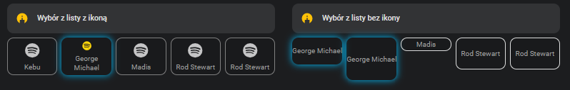
Konfiguruje się kolor kafelka, jego rozmiar i listę (zdefiniowaną już w systemie input_select), do której ma sięgać.
Wywołanie wygląda np. tak:
type: vertical-stack
cards:
  - square: false
    columns: 5
    type: grid
    cards:
      - type: custom:button-card
        template:
          - my_button_lista_no_icon
        variables:
          nazwa: George Michael
          ikona: mdi:spotify
          wysokosc: 50px
          kolor: blues
          lista_wyboru: playlista_spotify_sypialnia
      - type: custom:button-card
        template:
          - my_button_lista_no_icon
        variables:
          nazwa: George Michael
          wysokosc: 80px
          kolor: green
          lista_wyboru: playlista_spotify_sypialnia
      - type: custom:button-card
        template:
          - my_button_lista_no_icon
        variables:
          nazwa: Madis
          wysokosc: 25px
          kolor: yellow
          lista_wyboru: playlista_spotify_sypialnia
Następne template’y to obsługa buttonów typu “toggle”. I znowu wersje z ikoną lub bez.
(ty sa po kilka, żeby pokazać możliwości koloriowania i zmiany wymiarów, ale te oczywiście stosuje się pojedynczo)

Wywołanie:
type: custom:button-card
template:
  - my_toggle_button_icon
variables:
  entity: light.led_tv_gabinet
  nazwa: LED TV Gab
  ikona: mdi:led-strip
  wysokosc: 70px
  kolor: red
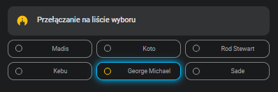
Wreszcie kolejna lista wyboru (jeden z wielu), ale w nieco innym ukłądzie graficznym:
Użycie:
type: vertical-stack
cards:
  - square: false
    type: grid
    cards:
      - type: custom:button-card
        template:
          - my_choice_list
        variables:
          nazwa: Madis
          lista_wyboru: playlista_spotify_sypialnia
          wysokosc: 35px
          kolor: red
      - type: custom:button-card
        template:
          - my_choice_list
        variables:
          nazwa: Koto
          lista_wyboru: playlista_spotify_sypialnia
          wysokosc: 35px
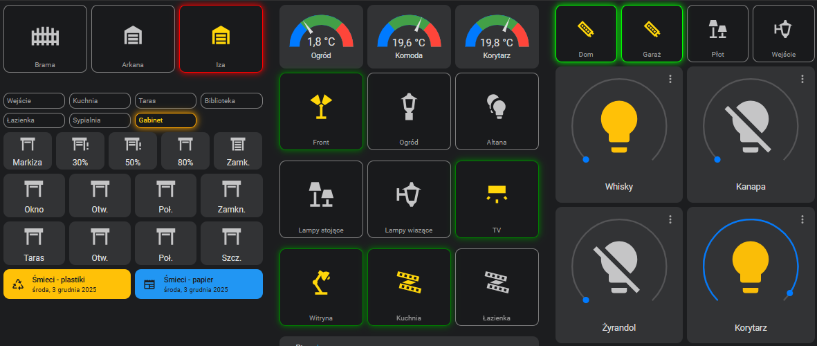
Tyle teorii, a teraz zastosowanie w praktyce, w moim HA:
Teraz kod (wszystkie template’y, można sobie wydłubać kto co potrzebuje)
button_card_templates:
  my_button_lista_icon:
    template:
      - ta_powiekszenie
    type: custom:button-card
    name: '[[[ return variables.nazwa ]]]'
    icon: '[[[ return variables.ikona ]]]'
    variables:
      ikona: mdi:speaker
      pelne_id: '[[[ return "input_select." + variables.lista_wyboru ]]]'
    triggers_update: all
    show_last_changed: false
    tap_action:
      action: call-service
      service: input_select.select_option
      service_data:
        entity_id: '[[[ return variables.pelne_id ]]]'
        option: '[[[ return variables.nazwa ]]]'
    state:
      - value: unavailable
        styles:
          icon:
            - color: grey
    styles:
      icon:
        - color: |
            [[[  if (states[variables.pelne_id].state == variables.nazwa )
              return 'rgba(255, 214, 10, 1)';
            else
              return 'var(--state-icon-color)';
            ]]]
        - border: |
            [[[  if (states[variables.pelne_id].state == variables.nazwa )
              return 'rgba(255, 214, 10, 1)';
            else
              return 'var(--state-icon-color)';
            ]]]
      grid:
        - grid-template-areas: '"i" "n"'
        - grid-template-rows: 1fr
        - gap: 5px
      card:
        - height: '[[[ return variables.wysokosc ]]]'
        - background-color: rgba(0, 0, 0, 0.1)
        - padding: 5px 5%
        - border: |
            [[[  if (states[variables.pelne_id].state == variables.nazwa )
              return 'solid 1px ' + variables.kolor;
            else
              return 'solid 1px gray';
            ]]]
        - box-shadow: |
            [[[  if (states[variables.pelne_id].state == variables.nazwa )
              return '0 0 0.95rem 0.01rem ' + variables.kolor;
            else
              return '';
            ]]]
      name:
        - color: '#9e9e9e'
        - font-size: 80%
        - white-space: normal
        - width: 100%
        - text-align: center
  my_button_lista_no_icon:
    template:
      - ta_powiekszenie
    type: custom:button-card
    name: '[[[ return variables.nazwa ]]]'
    icon: ''
    variables:
      pelne_id: '[[[ return "input_select." + variables.lista_wyboru ]]]'
    triggers_update: all
    show_last_changed: false
    tap_action:
      action: call-service
      service: input_select.select_option
      service_data:
        entity_id: '[[[ return variables.pelne_id ]]]'
        option: '[[[ return variables.nazwa ]]]'
    state:
      - value: unavailable
        styles:
          name:
            - color: grey
    styles:
      icon:
        - display: none
      grid:
        - grid-template-areas: '"n"'
        - grid-template-rows: 1fr
      card:
        - height: '[[[ return variables.wysokosc ]]]'
        - background-color: rgba(0, 0, 0, 0.1)
        - padding: 0 !important
        - border: |
            [[[  if (states[variables.pelne_id].state == variables.nazwa )
              return 'solid 1px ' + variables.kolor;
            else
              return 'solid 1px ';
            ]]]
        - box-shadow: |
            [[[  if (states[variables.pelne_id].state == variables.nazwa )
              return '0 0 0.95rem 0.01rem ' + variables.kolor;
            else
              return '';
            ]]]
      name:
        - color: '#9e9e9e'
        - font-size: 80%
        - white-space: normal
        - text-align: center
        - display: flex
        - align-items: center
        - justify-content: center
        - width: 100%
        - height: 100%
        - padding: 10px
  my_toggle_button_icon:
    template:
      - ta_powiekszenie
    type: custom:button-card
    name: '[[[ return variables.nazwa ]]]'
    icon: '[[[ return variables.ikona ]]]'
    entity: '[[[ return variables.entity ]]]'
    variables:
      ikona: mdi:toggle-switch
      entity: null
    triggers_update: all
    show_last_changed: false
    tap_action:
      action: toggle
    state:
      - value: 'on'
        styles:
          icon:
            - color: rgba(255, 214, 10, 1)
          card:
            - border: '[[[ return "solid 1px " + variables.kolor ]]]'
            - box-shadow: '[[[ return "0 0 0.95rem 0.01rem " + variables.kolor ]]]'
      - value: 'off'
        styles:
          icon:
            - color: var(--state-icon-color)
          card:
            - border: solid 1px gray
            - box-shadow: none
      - value: unavailable
        styles:
          icon:
            - color: grey
          card:
            - border: solid 1px grey
            - box-shadow: none
    styles:
      grid:
        - grid-template-areas: '"i" "n"'
        - grid-template-rows: 1fr min-content
      card:
        - height: '[[[ return variables.wysokosc ]]]'
        - background-color: rgba(0, 0, 0, 0.1)
        - padding: 5px 5%
      name:
        - color: '#9e9e9e'
        - font-size: 80%
        - white-space: normal
  my_toggle_button_no_icon:
    template:
      - ta_powiekszenie
    type: custom:button-card
    name: '[[[ return variables.nazwa ]]]'
    icon: ''
    entity: '[[[ return variables.entity ]]]'
    variables:
      entity: null
    triggers_update: all
    show_last_changed: false
    tap_action:
      action: toggle
    state:
      - value: 'on'
        styles:
          name:
            - color: rgba(255, 214, 10, 1)
          card:
            - border: '[[[ return "solid 1px " + variables.kolor ]]]'
            - box-shadow: '[[[ return "0 0 0.95rem 0.01rem " + variables.kolor ]]]'
      - value: 'off'
        styles:
          name:
            - color: '#9e9e9e'
          card:
            - border: solid 1px gray
            - box-shadow: none
      - value: unavailable
        styles:
          name:
            - color: grey
          card:
            - border: solid 1px grey
            - box-shadow: none
    styles:
      icon:
        - display: none
      grid:
        - grid-template-areas: '"n"'
        - grid-template-rows: 1fr
        - grid-template-columns: 1fr
        - align-items: center
        - justify-items: center
      card:
        - height: '[[[ return variables.wysokosc ]]]'
        - background-color: rgba(0, 0, 0, 0.1)
        - padding: 5px 5%
      name:
        - color: '#9e9e9e'
        - font-size: 80%
        - white-space: normal
        - text-align: center
        - width: 100%
        - height: 100%
        - display: flex
        - align-items: center
        - justify-content: center
  my_choice_list:
    template:
      - ta_powiekszenie
    type: custom:button-card
    name: '[[[ return variables.nazwa ]]]'
    icon: '[[[ return variables.ikona ]]]'
    variables:
      wysokosc: 35px
      kolor: deepskyblue
      ikona: mdi:checkbox-blank-circle-outline
      pelne_id: '[[[ return "input_select." + variables.lista_wyboru ]]]'
      border_inactive: grey
    show_last_changed: false
    triggers_update: all
    tap_action:
      action: call-service
      service: input_select.select_option
      service_data:
        entity_id: '[[[ return variables.pelne_id ]]]'
        option: '[[[ return variables.nazwa ]]]'
    layout: icon_name
    styles:
      grid:
        - grid-template-columns: 25%
      icon:
        - color: |
            [[[
              const current = states[variables.pelne_id]?.state || '';
              return (current === variables.nazwa)
                ? 'rgba(255, 214, 10, 1)'
                : '#9e9e9e';
            ]]]
      card:
        - height: '[[[ return variables.wysokosc ]]]'
        - background-color: rgba(0, 0, 0, 0.1)
        - border: |
            [[[
              const current = states[variables.pelne_id]?.state || '';
              return (current === variables.nazwa)
                ? 'solid 1px ' + variables.kolor
                : 'solid 1px ' + variables.border_inactive;
            ]]]
        - box-shadow: |
            [[[
              const current = states[variables.pelne_id]?.state || '';
              return (current === variables.nazwa)
                ? '0 0 0.95rem 0.01rem ' + variables.kolor
                : 'none';
            ]]]
      name:
        - color: '#9e9e9e'
        - font-size: 70%
        - white-space: normal
  ta_powiekszenie:
    style: |
      ha-card:hover {transform: scale(1.05);box-shadow: 0 0 10px;}