boskikak
13 Czerwiec 2025 18:59
1
Chciałbym założyć jeden ogólny wątek odnośnie wykresów i różnych konfiguracji wykresów w apexcharts. Korzystam od dawna i bardzo go cenię za prostotę i przejrzystość. Kto chce wrzucić coś nowego jako inspiracja to zapraszam.
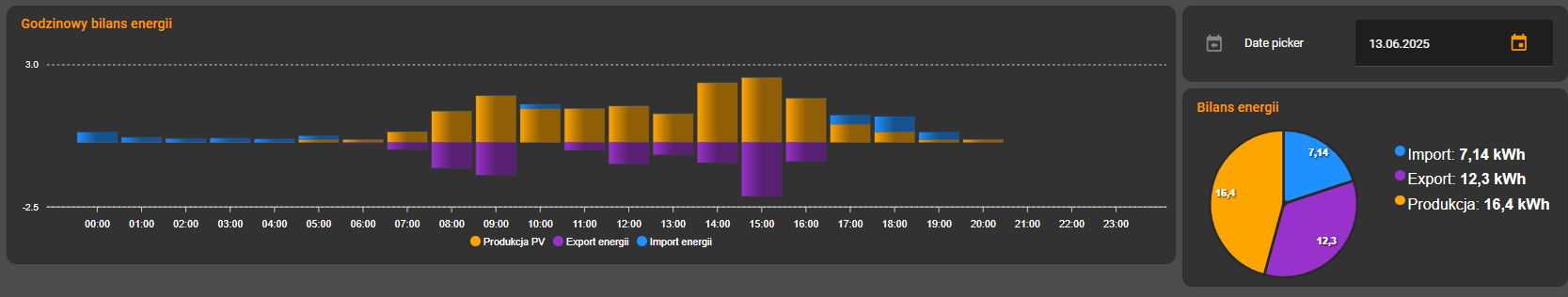
Apexcharts + data picker
Nie znalazłem w sieci takiej konfiguracji więc być może to jest pierwsza
- platform: template
  sensors:
    apex_days:
      friendly_name: "Dni do wykresów"
      icon_template: mdi:data
      value_template: >
        {% if state_attr('input_datetime.date_picker', "timestamp")==as_timestamp(states('sensor.date')) %}
          -0d
        {% else %}
          {{ ((as_timestamp(states('sensor.date'))|float(0) - state_attr('input_datetime.date_picker', "timestamp")|float(0)))/ -86400 }}d
        {% endif %}
Ten sensor będzie wykorzystywany do wykresów:
type: custom:layout-card
layout_type: custom:grid-layout
cards:
  - type: custom:config-template-card
    entities:
      - input_datetime.date_picker
    variables:
      offset: |
        {{states['sensor.apex_days'].state}}
    card:
      type: custom:apexcharts-card
      apex_config:
        chart:
          height: 250
          stacked: true
        plotOptions:
            columnWidth: 90%
            borderRadiusApplication: end
        fill:
          type: gradient
          gradient:
            type: horizontal
            shadeIntensity: 0.4
            opacityTo: 0.95
            inverseColors: false
      experimental:
        color_threshold: true
      graph_span: 1d
      span:
        start: day
        offset: ${offset}
      update_interval: 1h
      header:
        show: true
        title: Godzinowy bilans energii
        standard_format: false
        show_states: false
        colorize_states: true
      series:
        - entity: sensor.solarman_hourly_pv_generation
          name: Produkcja PV
          opacity: 90
          type: column
          statistics:
            align: start
            type: state
          fill_raw: last
          float_precision: 2
          yaxis_id: export
          group_by:
            func: last
            duration: 1h
          stroke_width: 0.1
          show:
            datalabels: false
            header_color_threshold: false
            legend_value: false
          color: orange
        - entity: sensor.energia_export_netto_hourly
          name: Export energii
          transform: return x *-1
          opacity: 90
          type: column
          fill_raw: last
          float_precision: 2
          yaxis_id: export
          group_by:
            func: last
            duration: 1h
          stroke_width: 0.1
          show:
            datalabels: false
            header_color_threshold: false
            legend_value: false
          color: darkorchid
        - entity: sensor.energia_import_netto_hourly
          name: Import energii
          opacity: 90
          type: column
          fill_raw: last
          float_precision: 2
          group_by:
            func: max
            duration: 1h
          stroke_width: 0.1
          show:
            datalabels: false
            header_color_threshold: false
            legend_value: false
          color: dodgerblue
  - type: vertical-stack
    cards:
      - type: entities
        entities:
          - input_datetime.date_picker
      - type: custom:config-template-card
        entities:
          - input_datetime.date_picker
        variables:
          offset: |
            {{states['sensor.apex_days'].state}}
        card:
          type: custom:apexcharts-card
          chart_type: pie
          graph_span: 1.1d
          update_interval: 1h
          span:
            offset: ${offset}
            end: day
          apex_config:
            chart:
              height: 300px
            legend:
              show: true
              position: right
              fontSize: 18px
            dataLabels:
              style:
                fontSize: 12px
          header:
            show: true
            title: Bilans energii
            show_states: false
            colorize_states: true
          series:
            - entity: sensor.sdm630_daily_import
              name: Import
              unit: " kWh"
              statistics:
                period: day
                align: start
                type: state
              group_by:
                func: max
                duration: 1d
              float_precision: 2
              show:
                datalabels: true
                extremas: false
                header_color_threshold: false
                legend_value: true
                in_chart: true
              color: dodgerblue
            - entity: sensor.sdm630_daily_export
              unit: " kWh"
              name: Export
              transform: return x *1
              opacity: 90
              fill_raw: last
              float_precision: 2
              group_by:
                func: last
                duration: 1d
              show:
                datalabels: true
                header_color_threshold: false
                legend_value: true
                in_chart: true
              color: darkorchid
            - entity: sensor.solarman_daily_pv_generation2
              name: Produkcja
              unit: " kWh"
              transform: return x *1
              opacity: 90
              fill_raw: last
              float_precision: 2
              group_by:
                func: last
                duration: 1d
              show:
                datalabels: true
                header_color_threshold: false
                legend_value: true
                in_chart: true
              color: orange
layout:
  grid-template-columns: 75% 25%
Jeśli chodzi o wykresy godzinowe czy dobowe to polecam korzystać ze statystyk która jest zawarta w konfiguracji karty.
1 polubienie
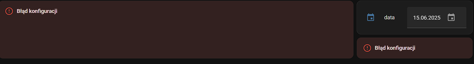
Jakiej wersji Apex Charts używasz? Bo za wyjątkiem daty nic mi nie wyświetla:(
boskikak
15 Czerwiec 2025 16:15
3
Wersji V2.1.2. Żadne wykresy ci się nie wyświetlają?
No zadne. Coś robię nie tak pewnie.
Utworzyłem pomocnika
Dodałem sensor template do configuration.yaml (zmieniłem nazwę encji bo u Ciebie jakoś inaczej to pokazywało)
Wklejam kod karty i zmieniam nazwy encji na własne: godzinowy import, export i produkcja PV oraz do tego kołowego dzinne
type: custom:layout-card
layout_type: custom:grid-layout
cards:
  - type: custom:config-template-card
    entities:
      - input_datetime.input_datetime_date_picker
    variables:
      offset: |
        {{states['sensor.apex_days'].state}}
    card:
      type: custom:apexcharts-card
      apex_config:
        chart:
          height: 250
          stacked: true
        plotOptions:
          columnWidth: 90%
          borderRadiusApplication: end
        fill:
          type: gradient
          gradient:
            type: horizontal
            shadeIntensity: 0.4
            opacityTo: 0.95
            inverseColors: false
      experimental:
        color_threshold: true
      graph_span: 1d
      span:
        start: day
        offset: ${offset}
      update_interval: 1h
      header:
        show: true
        title: Godzinowy bilans energii
        standard_format: false
        show_states: false
        colorize_states: true
      series:
        - entity: sensor.pv_godzinowo
          name: Produkcja PV
          opacity: 90
          type: column
          statistics:
            align: start
            type: state
          fill_raw: last
          float_precision: 2
          yaxis_id: export
          group_by:
            func: last
            duration: 1h
          stroke_width: 0.1
          show:
            datalabels: false
            header_color_threshold: false
            legend_value: false
          color: orange
        - entity: sensor.sprzedaz_godzinowa
          name: Export energii
          transform: return x *-1
          opacity: 90
          type: column
          fill_raw: last
          float_precision: 2
          yaxis_id: export
          group_by:
            func: last
            duration: 1h
          stroke_width: 0.1
          show:
            datalabels: false
            header_color_threshold: false
            legend_value: false
          color: darkorchid
        - entity: sensor.zakup_godzinowy
          name: Import energii
          opacity: 90
          type: column
          fill_raw: last
          float_precision: 2
          group_by:
            func: max
            duration: 1h
          stroke_width: 0.1
          show:
            datalabels: false
            header_color_threshold: false
            legend_value: false
          color: dodgerblue
  - type: vertical-stack
    cards:
      - type: entities
        entities:
          - entity: input_datetime.input_datetime_date_picker
      - type: custom:config-template-card
        entities:
          - input_datetime.input_datetime_date_picker
        variables:
          offset: |
            {{states['sensor.apex_days'].state}}
        card:
          type: custom:apexcharts-card
          chart_type: pie
          graph_span: 1.1d
          update_interval: 1h
          span:
            offset: ${offset}
            end: day
          apex_config:
            chart:
              height: 300px
            legend:
              show: true
              position: right
              fontSize: 18px
            dataLabels:
              style:
                fontSize: 12px
          header:
            show: true
            title: Bilans energii
            show_states: false
            colorize_states: true
          series:
            - entity: sensor.dzienny_pobor
              name: Import
              unit: " kWh"
              statistics:
                period: day
                align: start
                type: state
              group_by:
                func: max
                duration: 1d
              float_precision: 2
              show:
                datalabels: true
                extremas: false
                header_color_threshold: false
                legend_value: true
                in_chart: true
              color: dodgerblue
            - entity: sensor.sprzedaz_dzienna
              unit: " kWh"
              name: Export
              transform: return x *1
              opacity: 90
              fill_raw: last
              float_precision: 2
              group_by:
                func: last
                duration: 1d
              show:
                datalabels: true
                header_color_threshold: false
                legend_value: true
                in_chart: true
              color: darkorchid
            - entity: sensor.deye_inverter_daily_pv_production
              name: Produkcja
              unit: " kWh"
              transform: return x *1
              opacity: 90
              fill_raw: last
              float_precision: 2
              group_by:
                func: last
                duration: 1d
              show:
                datalabels: true
                header_color_threshold: false
                legend_value: true
                in_chart: true
              color: orange
layout:
  grid-template-columns: 75% 25%
boskikak
15 Czerwiec 2025 16:53
5
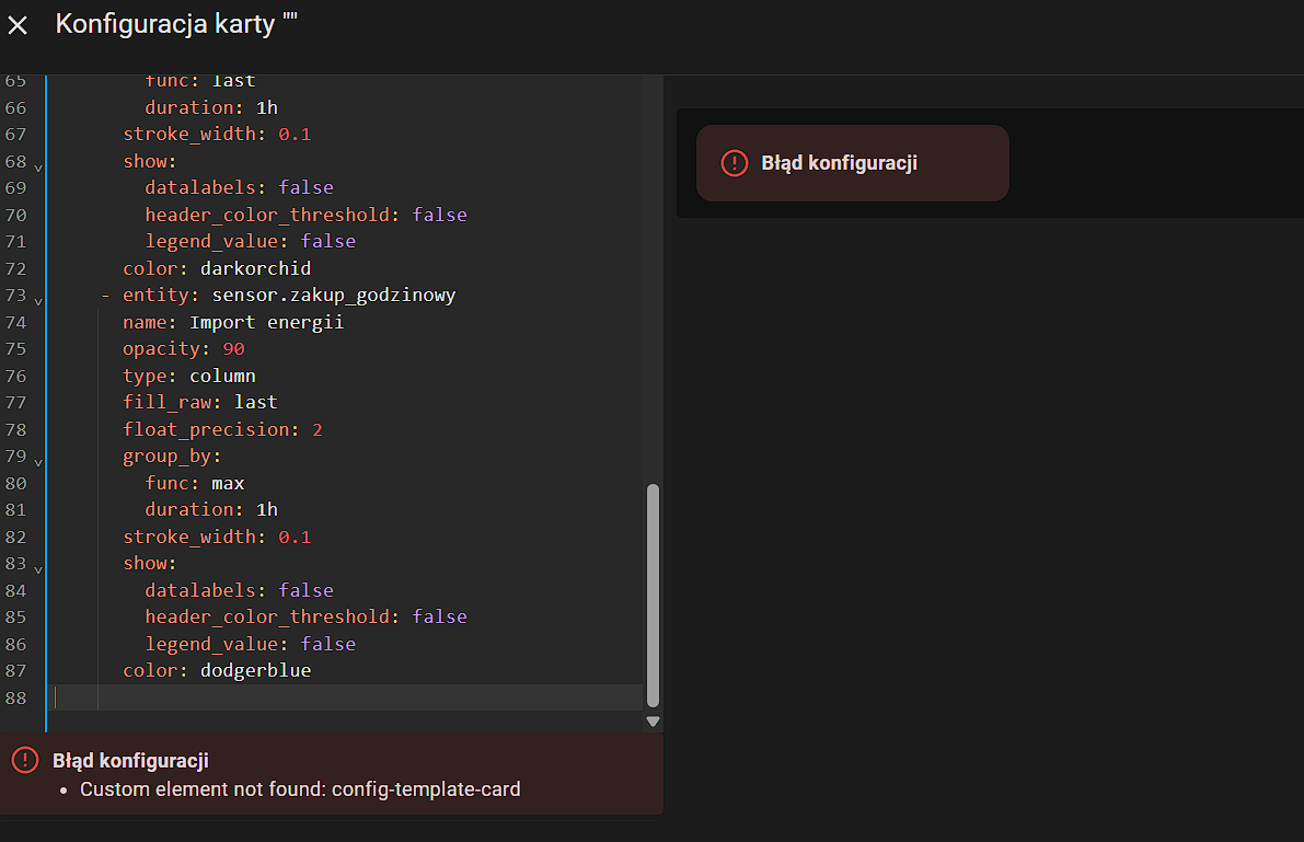
A layout card masz? Spróbuj najpierw dodać pojedyncze wykresy, łatwiej będzie znaleźć co powoduje błąd
szopen
15 Czerwiec 2025 17:34
7
No, ale przecież masz błąd biało na czerwonym - zainstalowałeś sobie plugina lovelace
config-template-card
?
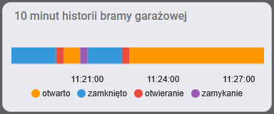
I masz rację. Tylko to i tak nie pomogło. Nic to -mam zwykły wykres:)
Podzielę się sposobem na wykres timeline, czyli taki że na poziomym pasku zaznaczone są zmieniające się w czasie stany - on/off albo przyjmujące kilka opisowych nazw. W Apexcharts ten typ wykresu nazywa się rangeBar z włączonym rangeBarGroupRows - i afaik kompletnie nie działa w HomeAssistant.
Mój sposób polega na użyciu wypełnienia wykresów typu area i ukrywaniu go, za pomocą minimum osi Y (do wersji 2.0.4 było to łatwiejsze, obecnie wspomagam się color_threshold). Dane z sensora np. drzwi są powtarzane jako serie tyle razy, ile odrębnych stanów ma być pokazanych na wykresie. Za pomocą opcji transform, stan przypisany do danej serii jest zamieniany na wartość 1 a wszystko inne (czyli brak tego stanu) na -1. Tooltipy pokazują zakres czasowy od-do.
Kod przykładu z obrazka, 4 różne stany
type: custom:apexcharts-card
series:
  - entity: cover.brama_garazowa
    transform: |
      return x === 'open' ? 1 : -1;
  - entity: cover.brama_garazowa
    transform: |
      return x === 'closed' ? 1 : -1;
  - entity: cover.brama_garazowa
    transform: |
      return x === 'opening' ? 1 : -1;
  - entity: cover.brama_garazowa
    transform: |
      return x === 'closing' ? 1 : -1;
all_series_config:
  stroke_width: 0
  name: Brama garażowa
  type: area
  curve: stepline
  color_threshold:
    - value: 0
      opacity: 0
    - value: 0.1
      opacity: 1
header:
  show: true
  title: 10 minut historii bramy garażowej
  show_states: false
graph_span: 10m
span:
  start: day
  offset: +11.3h
experimental:
  color_threshold: true
apex_config:
  chart:
    height: 105px
  grid:
    show: false
  legend:
    show: true
    formatter: |
      EVAL:function(name, o) {
        switch (o.seriesIndex) {
          case 0:
            return 'otwarto';
          case 1:
            return 'zamknięto';
          case 2:
            return 'otwieranie';
          case 3:
            return 'zamykanie';
        }
      }
  tooltip:
    "y":
      formatter: |
        EVAL:function(value, o) {
          if (value === 1)
            switch (o.seriesIndex) {
              case 0:
                return 'otwarto';
              case 1:
                return 'zamknięto';
              case 2:
                return 'otwieranie';
              case 3:
                return 'zamykanie';
            }
        }
    x:
      formatter: |
        EVAL: function(ts, o) {
          if (typeof o == 'object') {
            let d1 = new Date(ts).toLocaleTimeString();
            let d2 = '';
            if (o.series[0].length > o.dataPointIndex + 1) {
              let dp = o.w.config.series[0].data[o.dataPointIndex+1][0];
              d2 = new Date(dp).toLocaleTimeString();
            }
            return `${d1} - ${d2}`;
          }
        }
  yaxis:
    show: false
    min: 0
  xaxis:
    type: datetime
    axisBorder:
      show: false
    tooltip:
      enabled: false
artpc
19 Czerwiec 2025 11:24
10
Jeżeli masz wszystkie wymagane składniki to błąd ten oznacza tyle że w którymś miejscu *. yaml masz błąd, wystarczy jedna spacja więcej i będzie błąd konfiguracji.
.yaml “chyba” poprawny -sprawdzałem tu:https://www.yamllint.com/
A jeśli chodzi o dodatki to niestety moja wiedza słaba i może czegoś brakować. Ale nie wiem czego.
artpc
19 Czerwiec 2025 18:33
12
Dziękuję za pomoc. Sprawdziłem- wszystkie dodatki są zainstalowane.
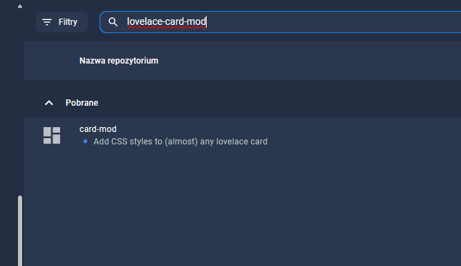
artpc:
lovelace-card-mod
Tej brakowało i zainstalowałem. Dodawałem też ten wpis w configuration.yaml
frontend:
  extra_module_url:
    - /local/card-mod.js
zamieniając ścieżkę dostępu
frontend:
  extra_module_url:
    - /homeassistant/www/community/lovelace-card-mod/card-mod.js
ale i to nie pomaga.
Jeszcze raz dziękuję za cierpliwość.
boskikak
20 Czerwiec 2025 07:14
14
Może zacznij od dodania pojedyńczej karty bo tak to możemy strzelać w nieskończoność…
type: custom:config-template-card
entities:
  - input_datetime.date_picker
variables:
  offset: |
    {{states['sensor.apex_days'].state}}
card:
  type: custom:apexcharts-card
  apex_config:
    chart:
      height: 250
      stacked: true
    plotOptions:
      bar:
        columnWidth: 90%
        borderRadiusApplication: end
    fill:
      type: gradient
      gradient:
        type: horizontal
        shadeIntensity: 0.4
        opacityTo: 0.95
        inverseColors: false
  experimental:
    color_threshold: true
  graph_span: 1d
  span:
    start: day
    offset: ${offset}
  update_interval: 1h
  header:
    show: true
    title: Godzinowa bilans energii
    standard_format: false
    show_states: false
    colorize_states: true
  series:
    - entity: sensor.solarman_hourly_pv_generation
      name: Produkcja PV
      opacity: 90
      type: column
      statistics:
        align: start
        type: state
      fill_raw: last
      float_precision: 2
      yaxis_id: export
      group_by:
        func: last
        duration: 1h
      stroke_width: 0.1
      show:
        datalabels: false
        header_color_threshold: false
        legend_value: false
      color: orange
    - entity: sensor.energia_export_netto_hourly
      name: Export energii
      transform: return x *-1
      opacity: 90
      type: column
      fill_raw: last
      float_precision: 2
      yaxis_id: export
      group_by:
        func: last
        duration: 1h
      stroke_width: 0.1
      show:
        datalabels: false
        header_color_threshold: false
        legend_value: false
      color: darkorchid
    - entity: sensor.energia_import_netto_hourly
      name: Import energii
      opacity: 90
      type: column
      fill_raw: last
      float_precision: 2
      group_by:
        func: max
        duration: 1h
      stroke_width: 0.1
      show:
        datalabels: false
        header_color_threshold: false
        legend_value: false
      color: dodgerblue
Tego też już próbowałem. Zmieniłem tylko encje na swoje i nic nie wyświetla, nie zwraca też błędu konfiguracji.
type: custom:config-template-card
entities:
  - input_datetime.date_picker
variables:
  offset: |
    {{states['sensor.apex_days'].state}}
card:
  type: custom:apexcharts-card
  apex_config:
    chart:
      height: 250
      stacked: true
    plotOptions:
      bar:
        columnWidth: 90%
        borderRadiusApplication: end
    fill:
      type: gradient
      gradient:
        type: horizontal
        shadeIntensity: 0.4
        opacityTo: 0.95
        inverseColors: false
  experimental:
    color_threshold: true
  graph_span: 1d
  span:
    start: day
    offset: ${offset}
  update_interval: 1h
  header:
    show: true
    title: Godzinowa bilans energii
    standard_format: false
    show_states: false
    colorize_states: true
  series:
    - entity: sensor.pv_godzinowo
      name: Produkcja PV
      opacity: 90
      type: column
      statistics:
        align: start
        type: state
      fill_raw: last
      float_precision: 2
      yaxis_id: export
      group_by:
        func: last
        duration: 1h
      stroke_width: 0.1
      show:
        datalabels: false
        header_color_threshold: false
        legend_value: false
      color: orange
    - entity: sensor.sprzedaz_godzinowa
      name: Export energii
      transform: return x *-1
      opacity: 90
      type: column
      fill_raw: last
      float_precision: 2
      yaxis_id: export
      group_by:
        func: last
        duration: 1h
      stroke_width: 0.1
      show:
        datalabels: false
        header_color_threshold: false
        legend_value: false
      color: darkorchid
    - entity: sensor.zakup_godzinowy
      name: Import energii
      opacity: 90
      type: column
      fill_raw: last
      float_precision: 2
      group_by:
        func: max
        duration: 1h
      stroke_width: 0.1
      show:
        datalabels: false
        header_color_threshold: false
        legend_value: false
      color: dodgerblue
boskikak
20 Czerwiec 2025 08:54
16
Sprawdziłem twój kod i u mnie działa więc nie wiem jak inaczej mogę ci pomóc. W narzędziach deweloperskich w zakładce statystyki, widnieją te twoje sensory?
Coś chyba źle wklejam ten wpis:
  # Szacowany chwilowy koszt energii
  - platform: template
    sensors:
      pstryk_koszt_chwilowy:
        friendly_name: "Koszt chwilowy"
        unit_of_measurement: "zł/h"
        value_template: >
          {% set power = states('sensor.pstryk_energy_meter_active_power_total') | float(0) %}
          {% set price = states('sensor.pstryk_gross') | float(0) %}
          {{ ((power / 1000) * price) | round(4) }}

  - platform: template
    sensors:
      apex_days:
        friendly_name: "Dni do wykresów"
        icon_template: mdi:data
        value_template: >
          {% if state_attr('input_datetime.date_picker', "timestamp")==as_timestamp(states('sensor.date')) %}
            -0d
          {% else %}
            {{ ((as_timestamp(states('sensor.date'))|float(0) - state_attr('input_datetime.date_picker', "timestamp")|float(0)))/ -86400 }}d
          {% endif %}
Niby akceptuje i na zielono konfiguracja.
boskikak
20 Czerwiec 2025 09:07
18
A gdzie to wkleiłeś? Do configuration.yaml czy do sensors.yaml?
configuration.yaml wkleiłem.- nie mam sensor.yaml
angler
20 Czerwiec 2025 09:18
20
Ja bym zaczął od wyczyszczenia pamięci cache przeglądarki.